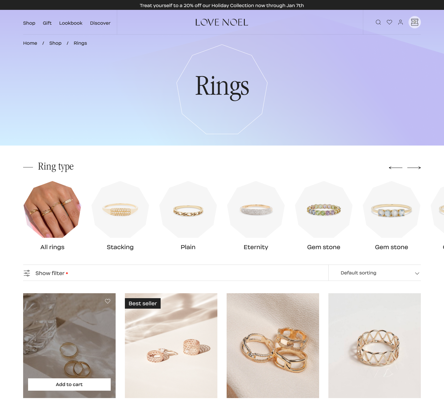
Filtering Experience
.jpg)
Complex Design Challenge
Tables are developed without clear guidance on necessary filtering columns. This led to most of the tables sharing the same filter sets. Secondly, the filter only has basic filtering options and does not have the necessary functionalities for more intricate filtering processes, leading to frustration for users who require more specific filtering criteria.
Enhance User Experience
- Revamp the filter system to provide a more flexible filter that suits different use cases and still ensures technical feasibility, with a focus on decrease the task completion time by 20%
- Measures of success were reducing cognitive efforts, clicks, and minimizing errors, among others.
Developing an Intuitive Filter System for Data-Heavy Platforms
- Created a clear guide that applies to all existing and future data table
- Expanded functionality with filtering by relevant conditions based on types of data
- Customized filter set for every data table and financial report
- Alignment with all use cases
Final Result
.png)
My Role
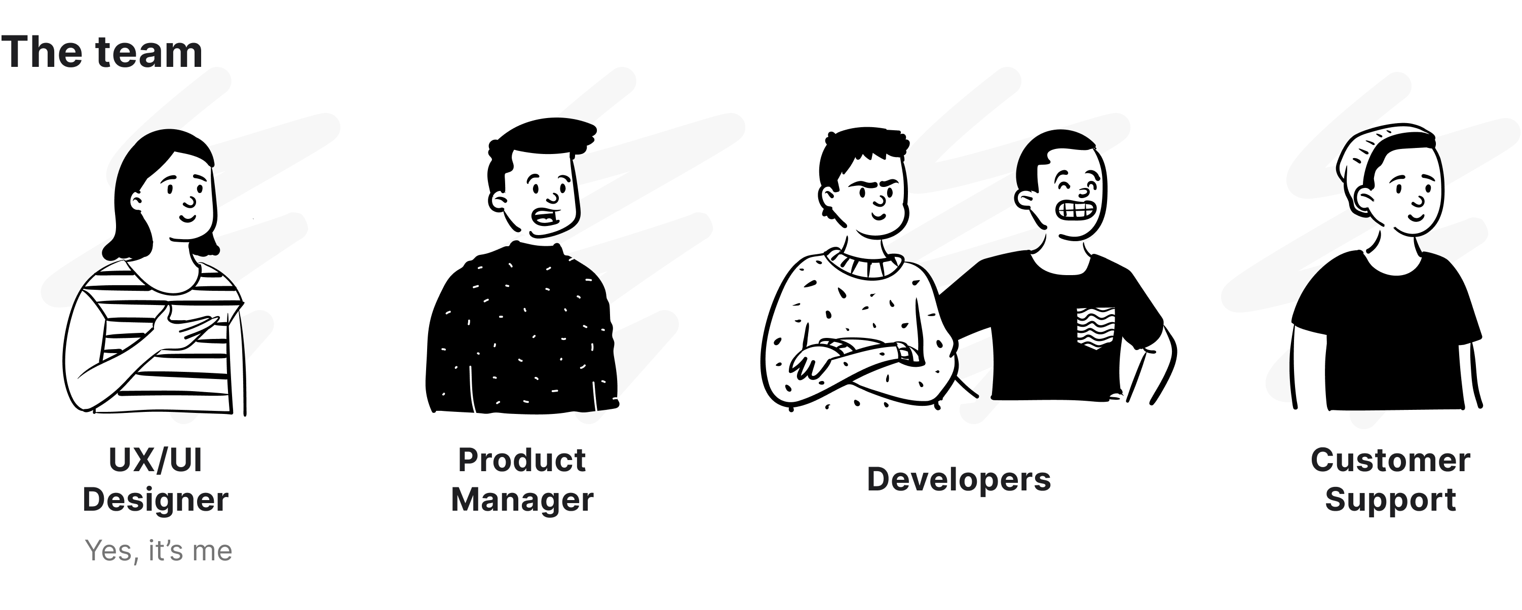
As a cross-functional team, we drew a plan to unpack and tackle problems from a user and business perspective, going through an extensive mapping over unhappy moments in the user journey, analyzing customer support requests to understand why users are encountering difficulties with our existing filtering system. I led UX and UI design of this project. I also received constructive feedback from different stakeholders through our brainstorming workshop in order to improve and get other perspectives on what I was designing.
Main tasks:
- Defining the project vision and objectives
- Customer insights and ideation
- Planning and scope definition
- User Interface and Experience
- Conduct Usability test
- Facilitate workshop with stakeholders through the project
.png)
UX Audit
I initiated my study by evaluating the previous solution, leading to the discovery of various usability and interaction issues, as well as potential visual enhancements. During this phase, I also made some assumptions that were verified in later stages.
The previous filter iteration had limited data attributes, intended for broad usage - both on the dashboard and in tables. This approach was taken to minimize technical effort while still being functional for basic tasks. However, with increasingly complex data and additional features, the filter's limitations become apparent, preventing users from fully utilizing it to efficiently analyze data.
Observe user behaviors and collect qualitative feedback
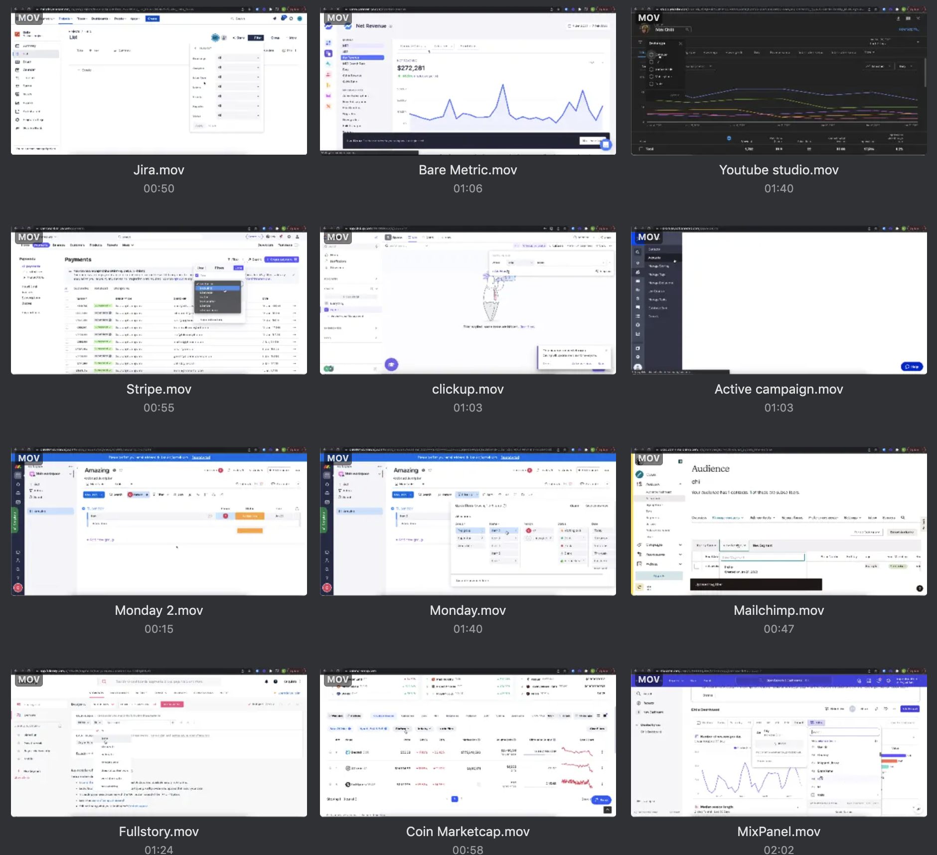
To have a better understanding of user interaction with the old solutions, I used Fullstory to observe and examine how users were using the filter feature. This revealed numerous evidence of usability and logic problems as well as verified my initial assumptions. Additionally, I obtained qualitative feedback from our internal customer success team to get more feedback/opinions from users.
Insights:
"…sometimes I cannot filter more complex data in the way that I want"
A simple drop-down menu in the filter bar will no longer meet the need of our users as (1) it requires a lot of scrolls, (2) lacks a good overview of all data, and (3) it is hard to have more than 5 filters in limited screen space.
Understanding different use cases
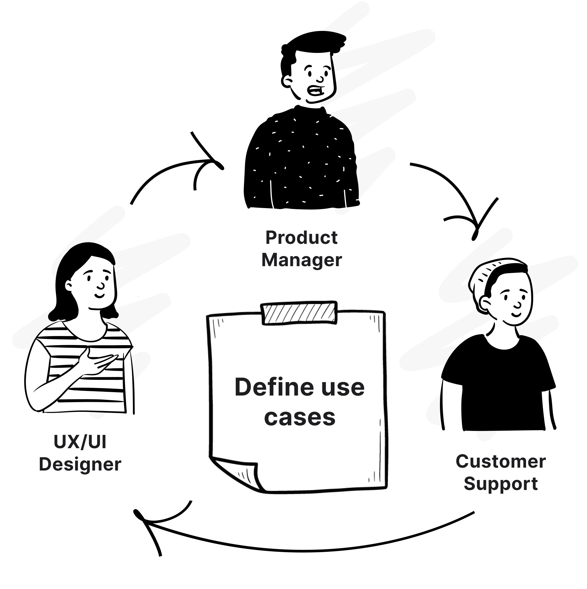
To grasp the issues, as a UX designer, I collaborated closely with the product manager and customer support to gain a comprehensive understanding of the various ways filters are used in Calqulate. Through the process of conceptualization and crafting user stories, we successfully identified the crucial use cases where filters are employed in distinct ways.
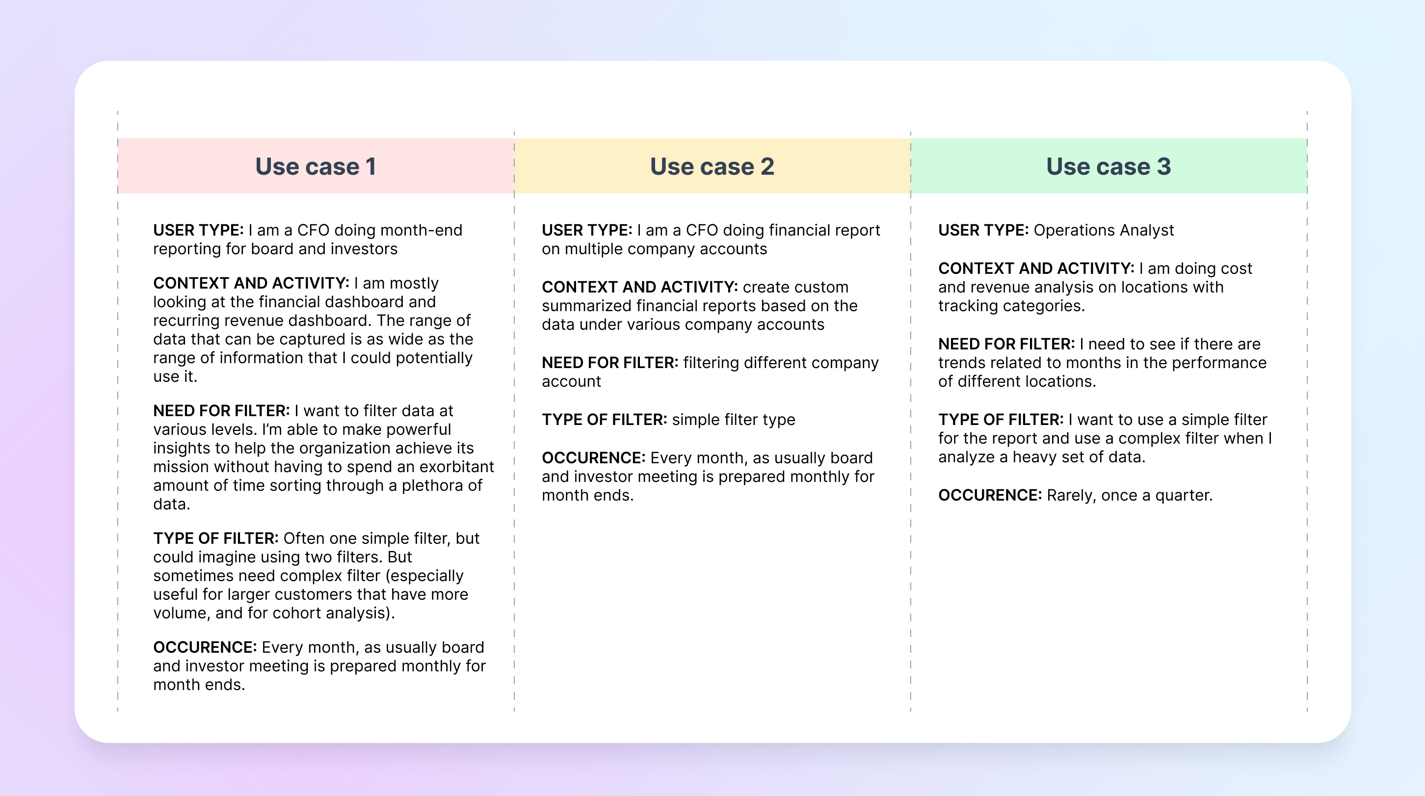
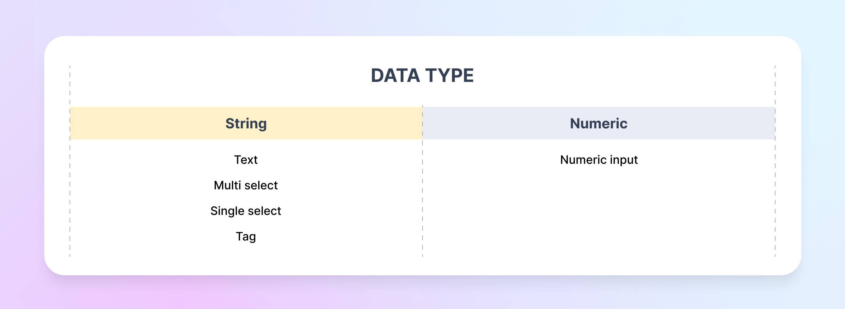
Based on that, I specified the data type to enhance comprehension of how the user can optimize data manipulation. It also helps me in taking technical limitations into account.
Challenge
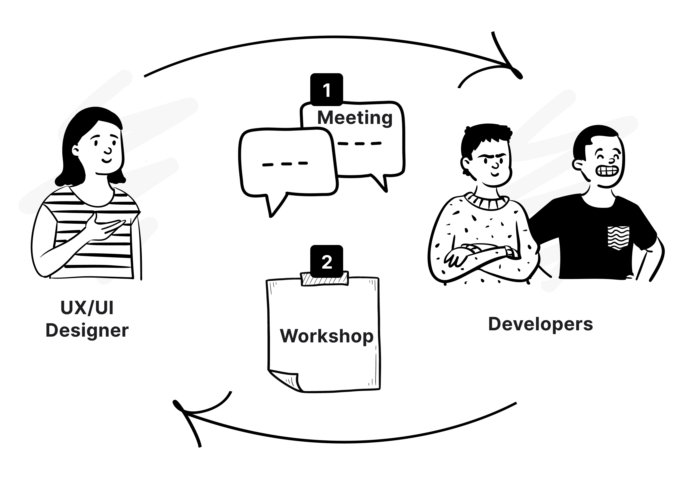
In this project, there was a critical technical constraint related to the fetching data logic. And if not addressed correctly, it could affect the web app's speed and usability. To solve this problem,
- I first had a meeting with the engineering team to gain a clear understanding of what the standout constraint of our technology was
- Then I facilitated a workshop with the engineering team to find feasible solutions that met the project's goals.
Core Problem
Through extensive research, I identified and prioritized issues with the old filter version. Collaborating with the Product Manager, we established business requirements and defined UX tasks for the upcoming design stages.
- Not intuitive for multi-select data filter (click-consuming, time-consuming)
- No customized filter sets for different tables/data
- Inadequate in fulfilling the needs of users who need more complex filter sets for their specific needs
- Lack of visual feedback
Requirements and UX actionable:
- Making the filtering experience easy and intuitive
- Optimizing for the most common use cases
- Fixing the visual and usability issues with the old filter
- Compatibility with other components (header), and performance requirements such as load-bearing capacity or speed.
Benchmarking
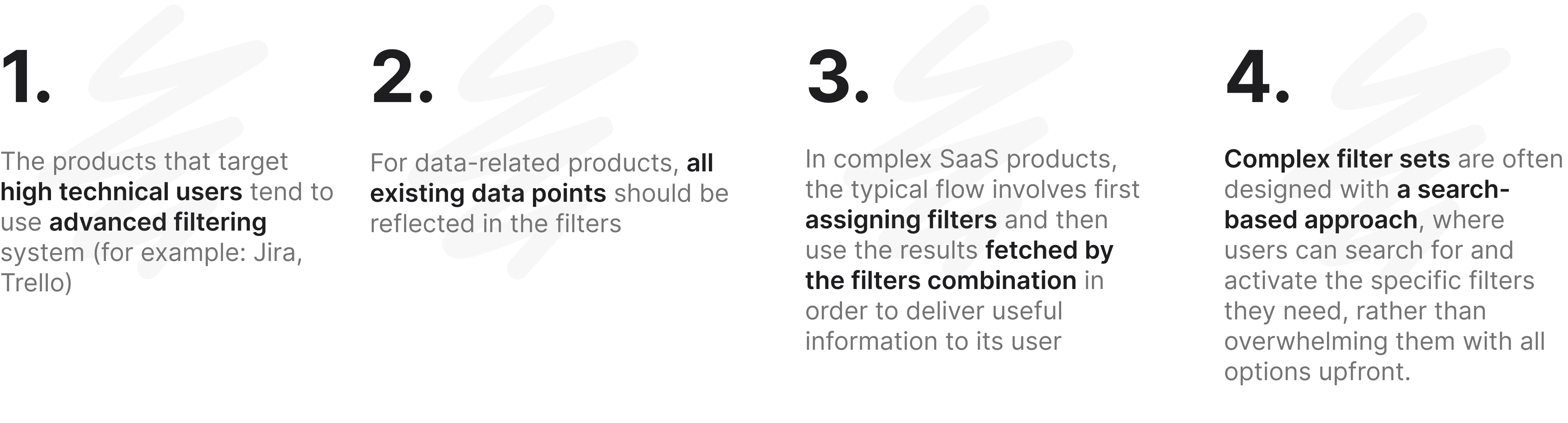
Benchmarking involves evaluating and comparing products to gain insights and understanding of best practices. I focused on benchmarking complex data and multi-environment products, analyzing their features and approaches to inform decision-making and design a filter that meets our users' requirements and expectations.
Insights from benchmarking
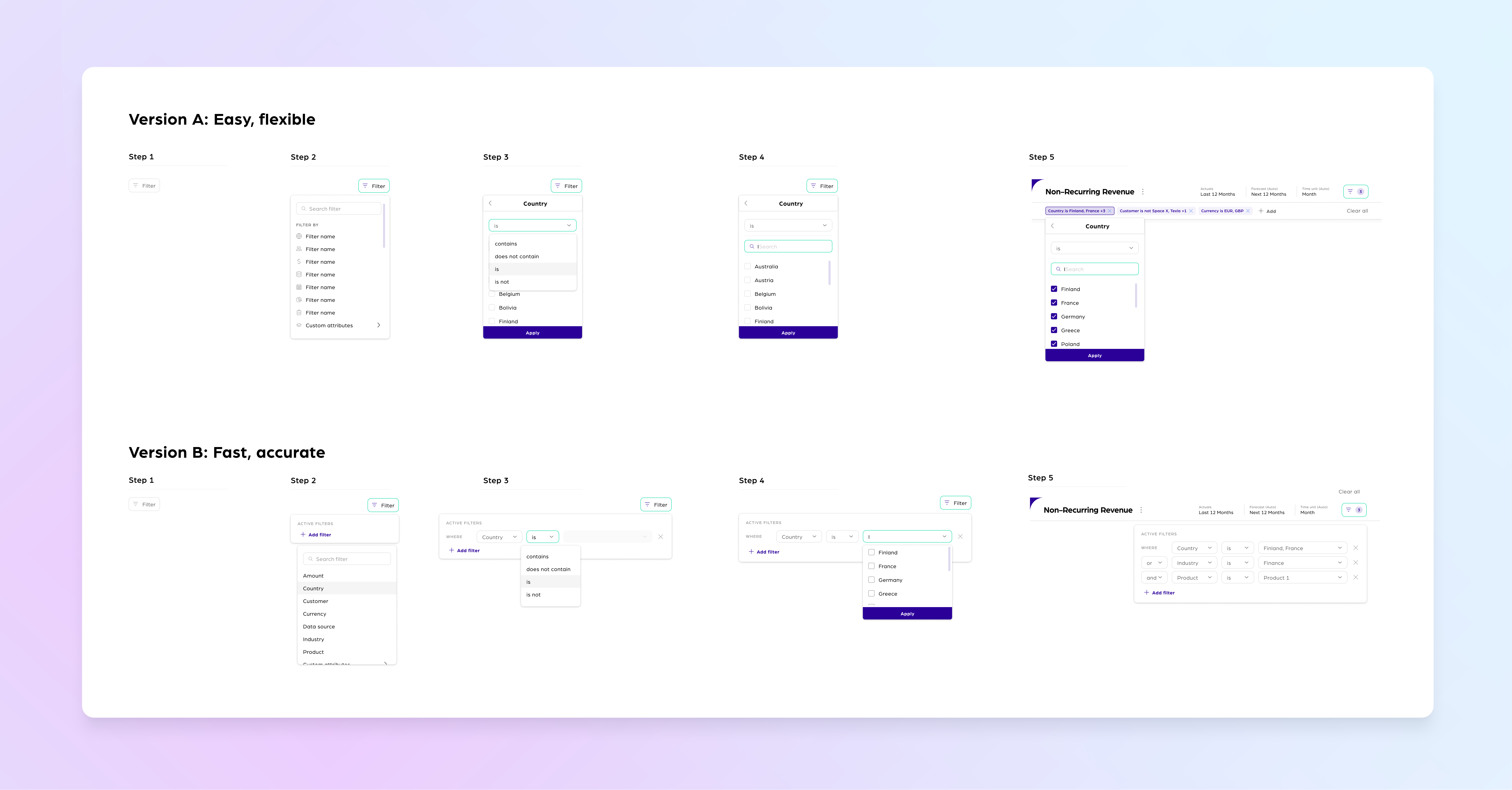
Ideating and Prototyping
As I defined types of data we focused on filtering. Before, we primarily had a simple search that did not cover the user’s needs. This led us to explore the option of implementing filters based on specific conditions, with the ability to choose a logical operator. I and PM then compiled a list of conditions for each data type, which included the following:
.png)
.png)
Through multiple design iterations, I prioritized different requirements and gathered feedback from workshops with the design team. With two distinct design versions, each focusing on specific requirements, I progressed to the user testing stage to evaluate their effectiveness.
User Testing
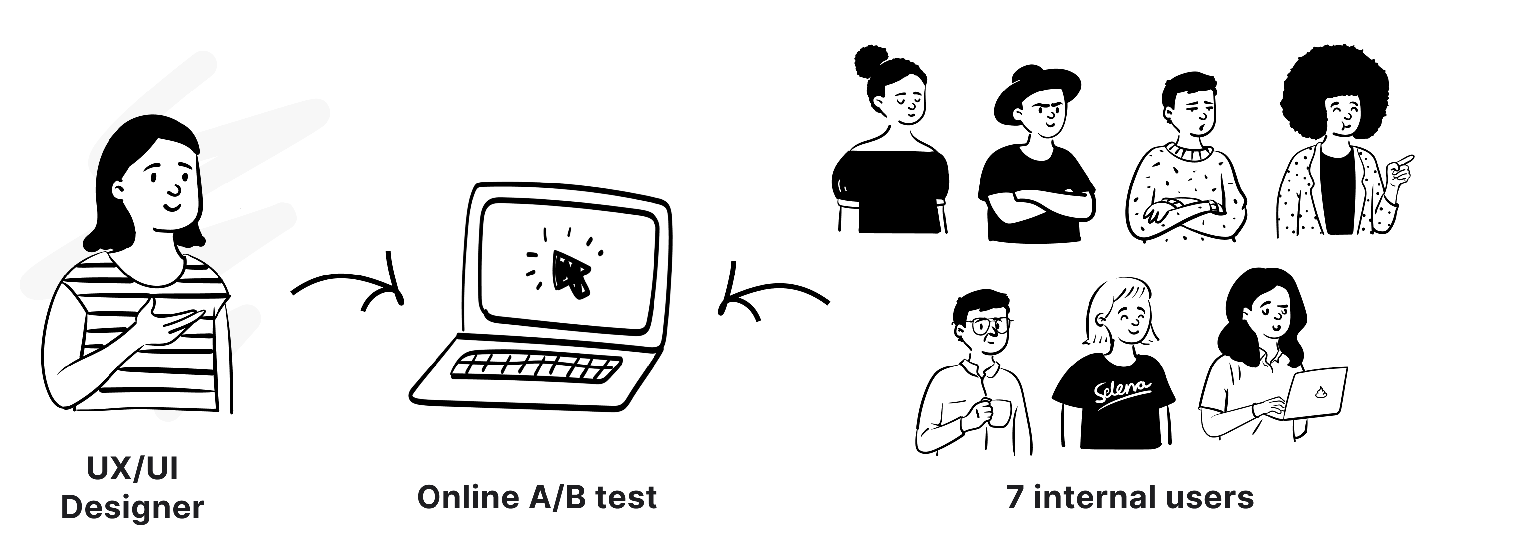
To assess the effectiveness and efficiency of the proposed solutions, I conducted a usability test with 7 participants. The test aimed to evaluate user-friendliness and alignment with target user needs. A detailed protocol ensured systematic and controlled testing, focusing on different requirements.
Insights:
- Users displayed greater familiarity with the interaction in Version A.
- User preferences were influenced by their current job roles; those with technical backgrounds tended to prefer the more complex Version B, while those with business backgrounds favored Version A.
- Business-background users found Version B to be potentially excessive for their needs.
In conclusion, we opted for Version A, as it required a shorter learning curve compared to Version B and better aligned with the needs of users with a business background.
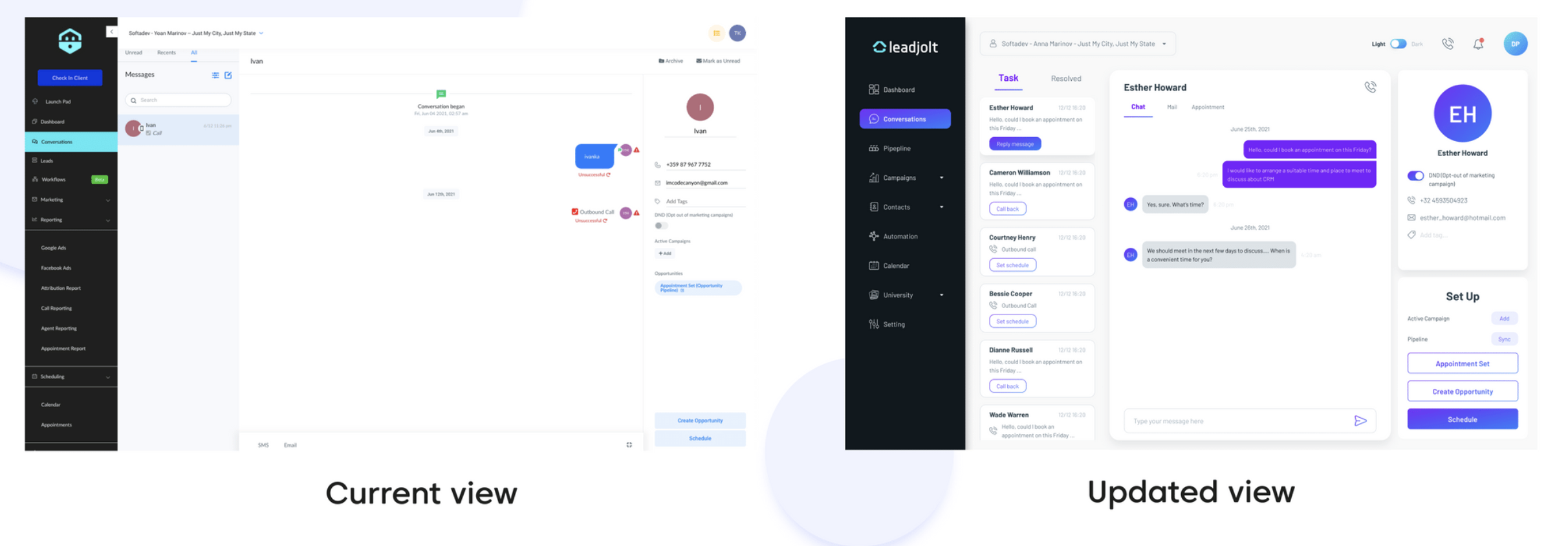
Delivery & Hand-off
.png)
Upon validation of the final solution, I provided the tech team with well-structured and easily understandable mock-ups. Additionally, I worked with the product manager to create and document the product specifications and presented my work through a demo call. Throughout the implementation phase, I collaborated closely with developers to ensure a seamless implementation of the filter and prevent any misunderstandings or gaps in information that could impact their work. Once the feature was ready in the staging environment, we held Q&A sessions to thoroughly review the feature and ensure that the actual product functions exactly as specified in my design.
Check how I documented the filter component here
Defining Metrics
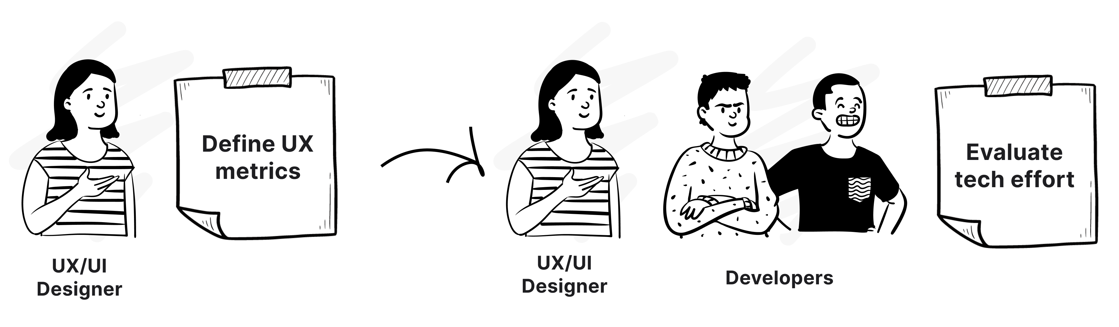
Upon completing the delivery of the new solution, I promptly turned my attention to defining success metrics. This evaluation aims to assess the solution's effectiveness and user-friendliness, providing valuable insights for further enhancements. Close collaboration with the technical team is necessary to accurately evaluate the balance between UX priorities and technical feasibility.
My main takeaways from this project are:
- When designing financial software knowing your target audience is key. Depending on the roles and purpose, each user has different needs when working with data manipulation.
- The importance of involving the relevant stakeholders in problem-solving and using a collaborative approach to find effective solutions, especially when it relates to the technical side

Main Tasks
I led the Product Design - User Experience (UX) and User Interface (UI) of this project. As this is the initial feature of our new production environment, it's crucial to comprehend the vision and insights from end users. We as a cross functional team need to align the product roadmap with our current system.
- Collaborate with the Product Manager (PM) and Business Analyst (BA) to define the requirements and success metrics for the feature.
- Collaborate with the CEO to gain a deeper understanding of the vision for the new product environment and to gather insights from investors and startups, who are the end users of this platform.
- Work with the PM to create a user flow and information architecture that ensures coherence between the two production environments.
- Develop prototypes to visualize the functionality and user interface of the feature.
- Collaborate closely with developers to ensure the successful implementation of the feature and incorporate prioritized success metrics after launch.
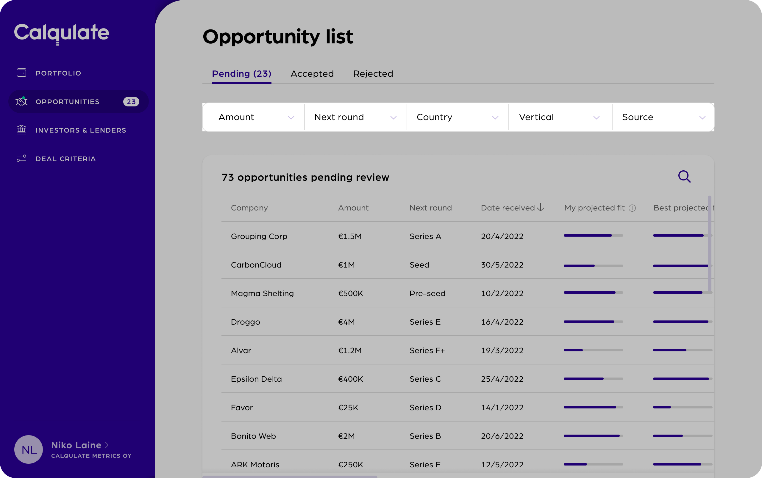
Business Perspective
.png)
Streamlining communication between investors and companies across different production environments is a crucial aspect of Calqulate. In the investor production environment, Calqulate offers the Opportunity List, which features companies using our financial reporting tool and seeking new funding.
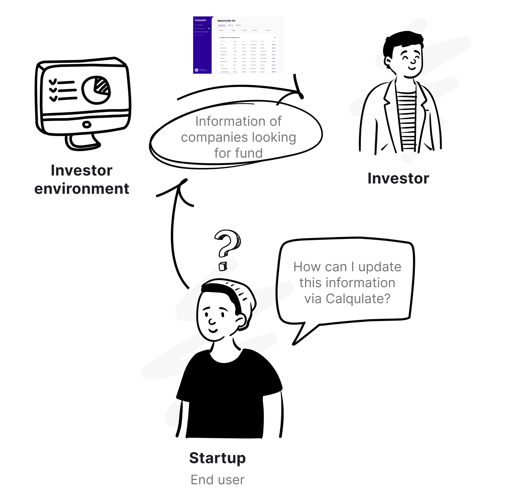
However, the key to platform development lies in increasing the user base to attract more customers. Currently, companies that solely want to use Calqulate for funding purposes without utilizing financial reporting lack a way to join. Therefore, by creating a simplified process for companies to join Calqulate while still providing sufficient information to connect with suitable investors, we can scale up our user base and increase revenue. This is why our first step is to examine both user types' production environments and identify opportunities while maintaining coherence between them.
User Insights
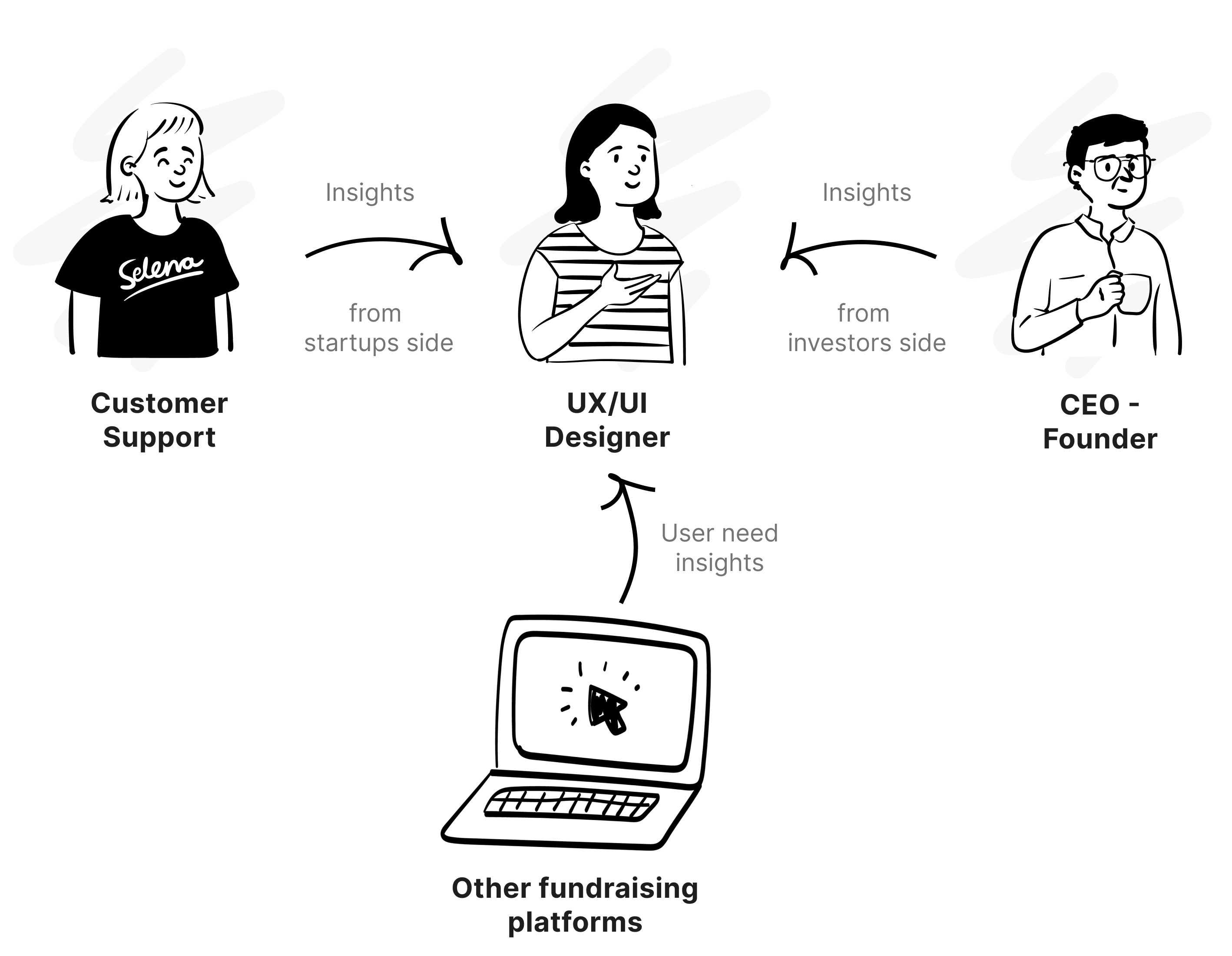
Despite limited time and budget preventing direct user research, I gathered user needs through the business team. Our CEO collaborates directly with investors and advisors, gathering their needs and pain points in the fundraising process, then shared with the product team for effective solution development. Additionally, insights from the sales team, who onboard companies seeking funding, provide valuable input. Although this approach may introduce bias from the middleman, it still yields invaluable insights to develop the solution. That was the foundation to spot pain points from both sides and uncover opportunities.
.png)
Desk Research
Additionally, I conducted research on data and processes related to other fundraising platforms to gain insights into these target users behavior and benchmark innovative methods for companies to create investor relation and monitor portfolio.
%20(1).png)
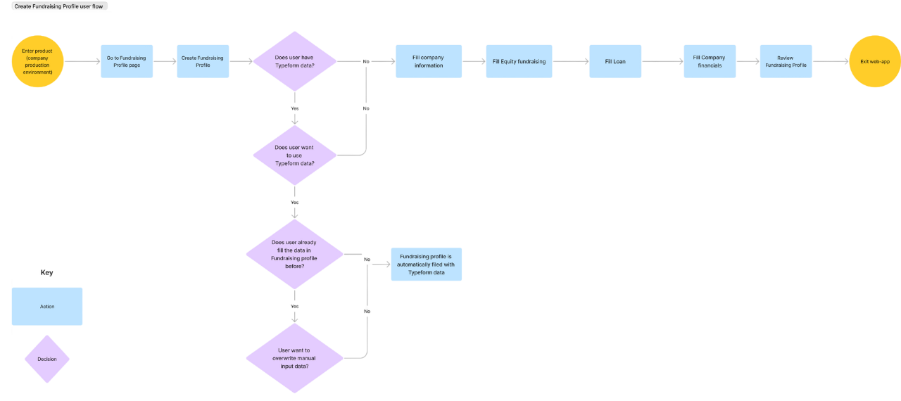
User Flow
Utilizing the insights gathered from users, business stakeholders, and the technical perspective, I conducted collaborative sessions with the Product Manager and other team members to brainstorm various solutions for addressing the identified issues. We focused on mapping out the user flow to ensure the solution aligns cohesively with the other production environment.
Ideating and Prototyping
Onboard
Since this Fundraising profile platform differs from competitors available in the market, it’s important that users understand the value they can get from the platform quickly.
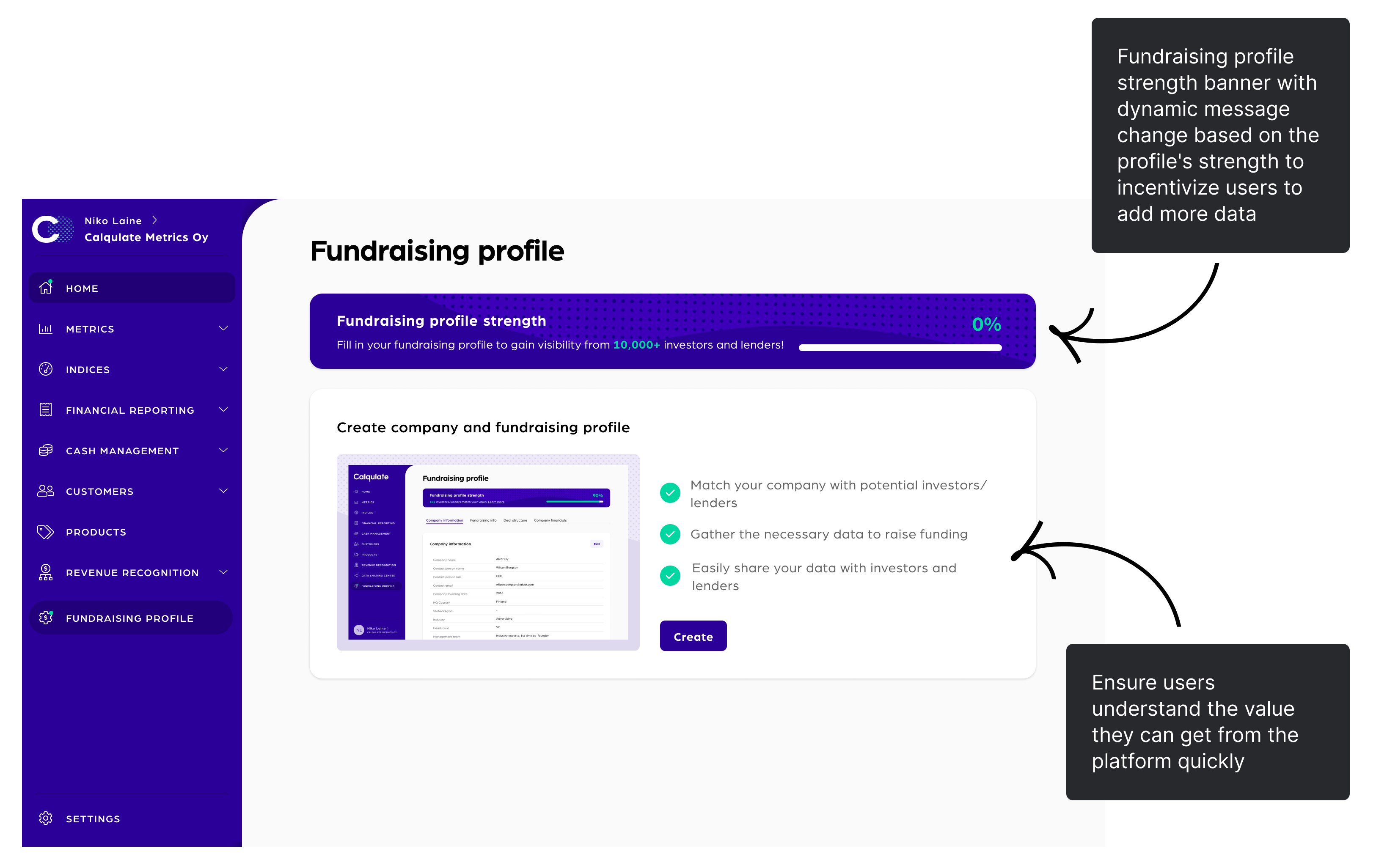
We implemented the concept of fundraising profile strength, calculated based on the data input by the user. The score increases as more data is provided. To incentivize users to add more data, we introduced a dynamic banner that remains visible, displaying messages that change based on the profile's strength. By providing incentive information, we aim to encourage users to input a greater amount of data when creating their fundraising profiles.
Input data process: Step 1
When creating a fundraising profile, there are two cases to consider:
- Users who sign up directly on Calqulate: We initiate the profile creation process with a simple and basic information form modal. The form is pre-filled with information that users have already provided during sign-up (company name, address, and email). This approach minimizes manual and repetitive work for users. To reduce cognitive load, we divide the Step 1 form into two parts, ensuring it does not become too long or overwhelming. Once users complete this step, they can immediately observe an increase in their fundraising profile strength. Seeing immediate results acts as an incentive for users to proceed and complete the remaining steps.
.png)
- Users who sign up through Typeform (have previously answered financial information in the questionnaire): we offer the option to directly import that data into their fundraising profile. However, if users choose not to utilize the previously inputted data, they still have the flexibility to change their decision at a later stage. This approach ensures that users have control over the data they want to include in their fundraising profile and can make adjustments as needed.
.png)
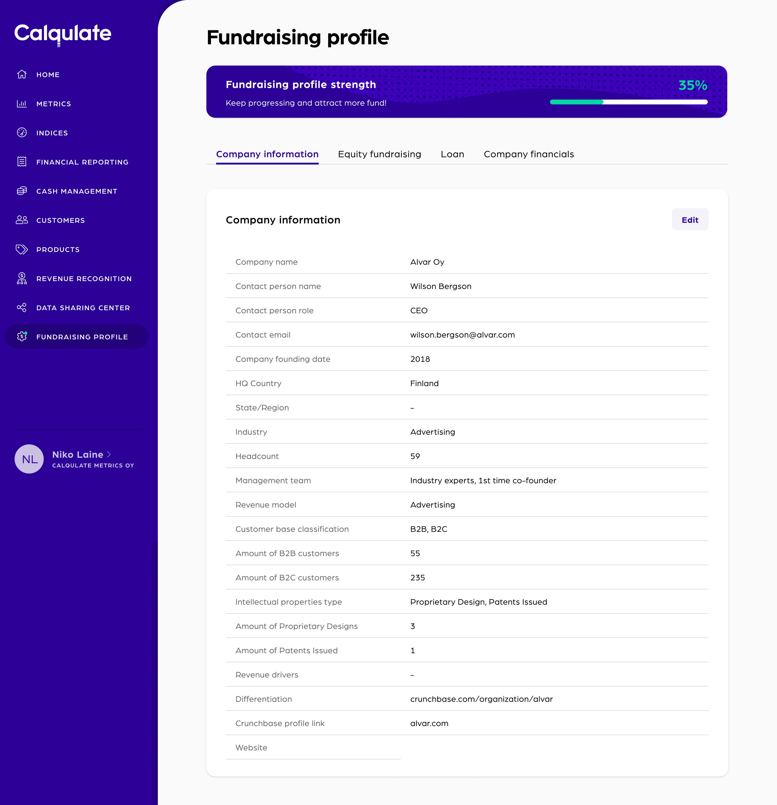
Input data process: Step 2
After completing the initial steps, users gain access to the remaining tabs of the fundraising profile. They have the flexibility to choose the order in which they input the required data. Recognizing that the profile entails substantial data input, which can be tiresome for users, we ensure that users understand the significance of each data field. To provide clarity, we include a banner in each form, explaining the reasons why investors need to know the specific information. This informative approach is applied to all tabs within the fundraising profile.
.png)
Other screens
.png)
Defining Metrics
The fundraising profile underwent iterations through usability tests, A/B tests, and in-depth surveys to enhance its initial version based on user feedback.
However, launching this functionality marks just the initial phase of the program's success.
To further evaluate its performance and shape the product roadmap, analyzing key metrics such as drop rate, task success rate, time on task, error rate, and completion percentage of the fundraising profile is crucial. These metrics provide valuable insights for understanding success and guiding future improvements.
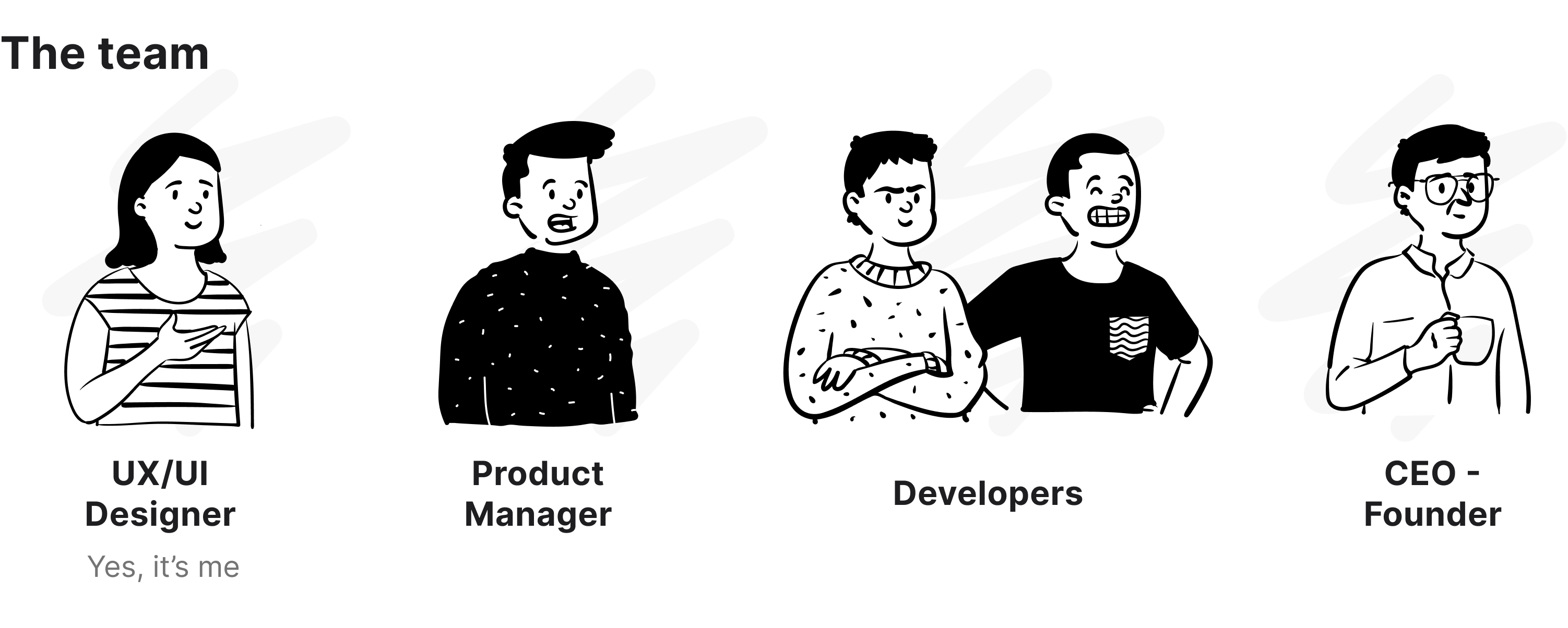
Main Tasks
I took charge as the main UX/UI designer in this project. I collaborated with the project manager, and development team as well as communicated with clients throughout the project.
Main tasks:
- Business requirement gathering
- Collect customer insights
- Conduct UX audit for the product
- Define the project’s scope and UX goals
- Ideate and propose UX solutions
.png)
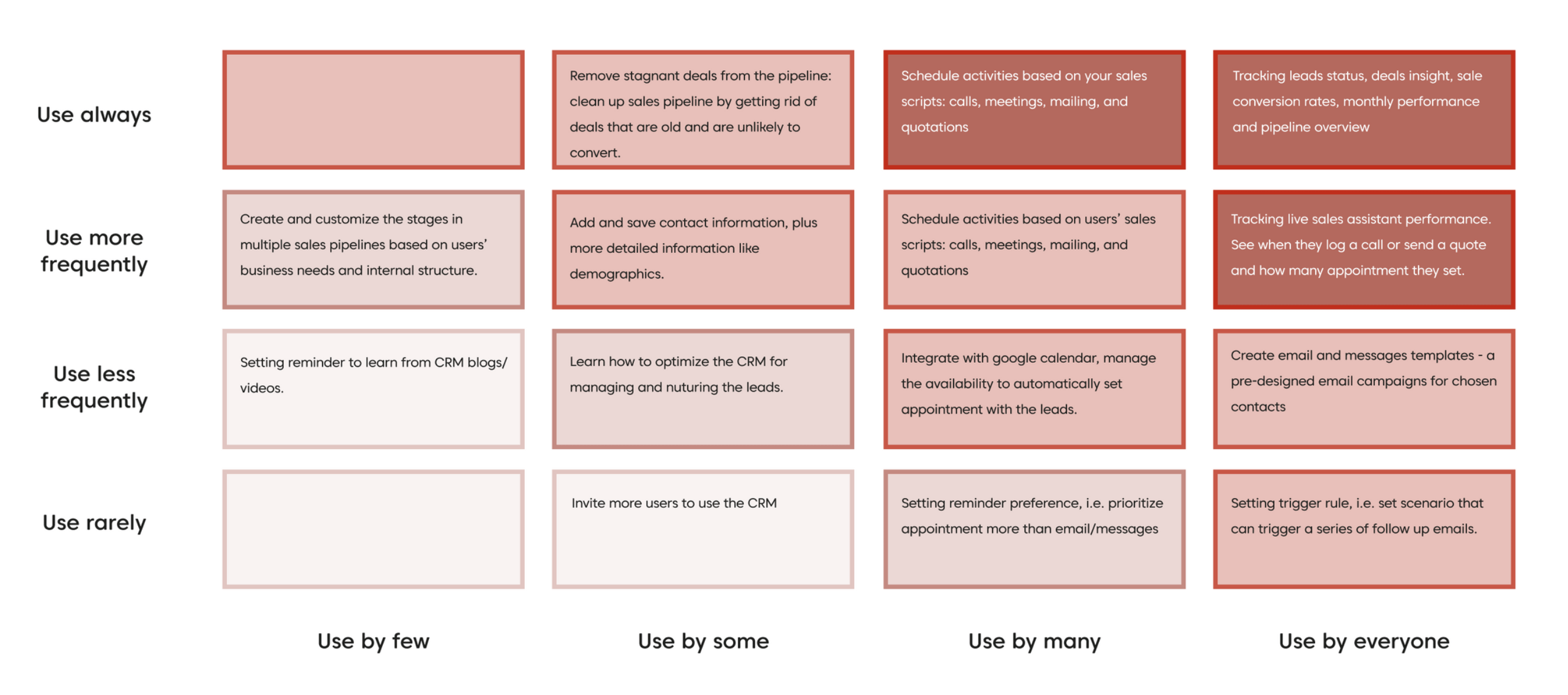
Red-routes Analysis
In UX design, the red route matrix helps designers to identify the critical and frequent tasks that users perform with the product to achieve their goals. These tasks are the foundational user journeys that define the value of the product. Therefore, they bring a substantial impact to the user experience. This allowed me to focus on users' needs and get rid of unnecessary features.
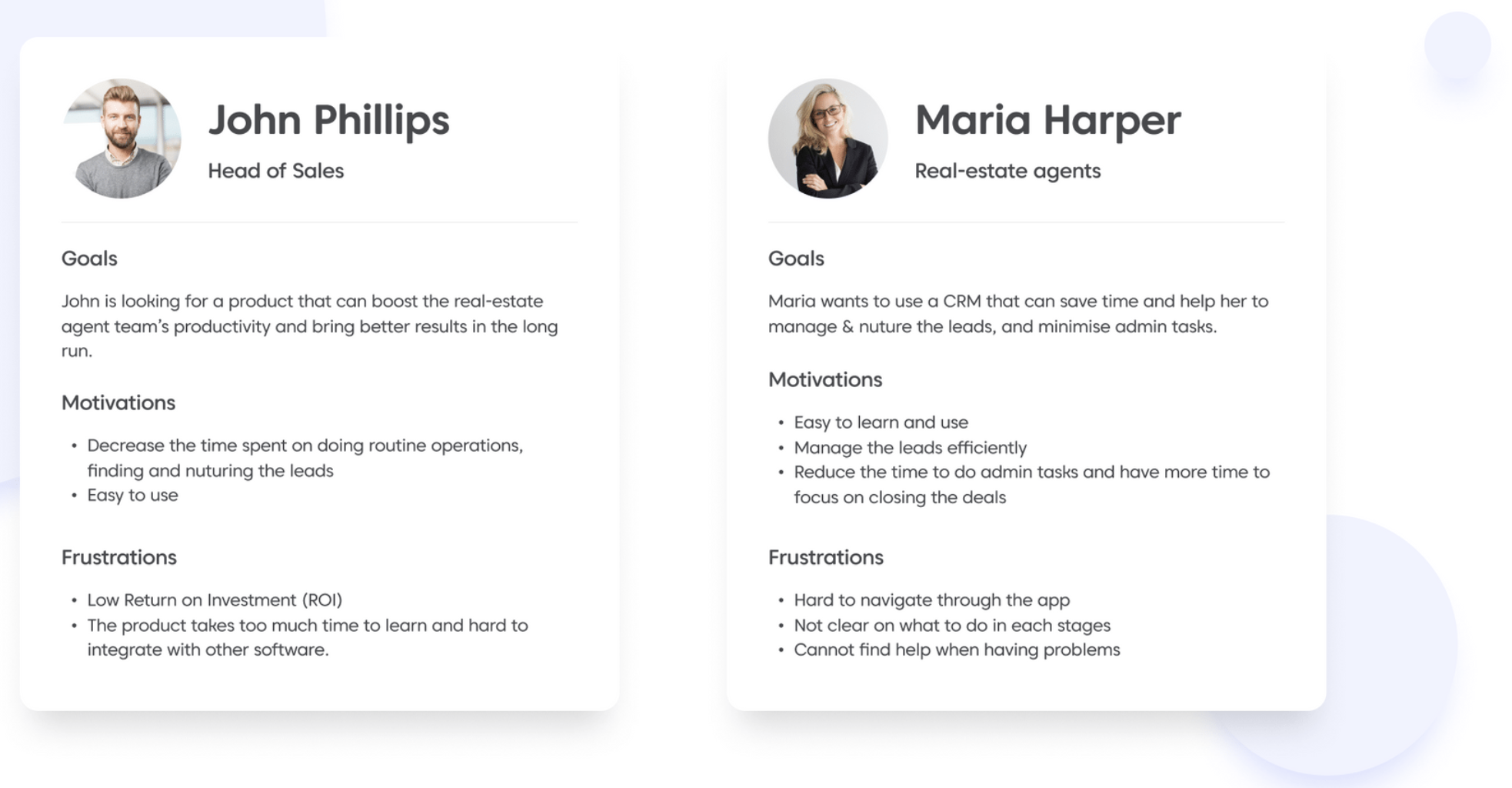
User Persona
User behavior reveals a great deal about what's working or lacking in a product. It provides insights into which are friction points, where and why users drop off. I created these user personas after validating them with Leadjolt's key stakeholders (founders and the customer success team). In this case, there are two main users that we need to care about. The first and foremost user of the product is the direct users, who use our product in their daily lives - the real estate agent in the organization. However, the purchaser of the product is the decision maker in the organization (Managers, CEO, CFO).
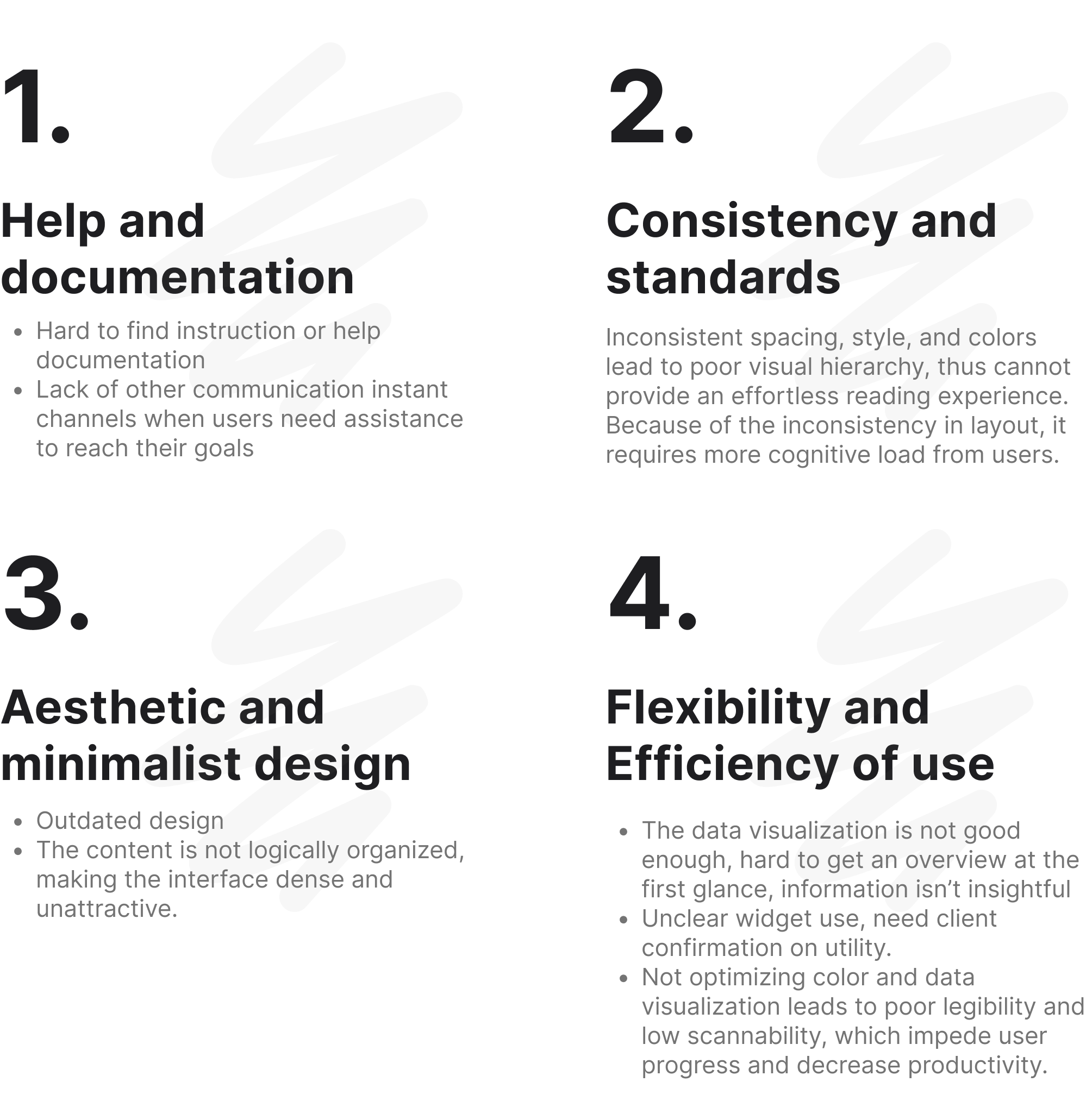
Heuristic Analysis
Based on Jacob Nielsen’s 10 heuristic principles, I conducted a heuristic analysis to define the usability problems in the user interface design. It is an indispensable step when evaluating the product.
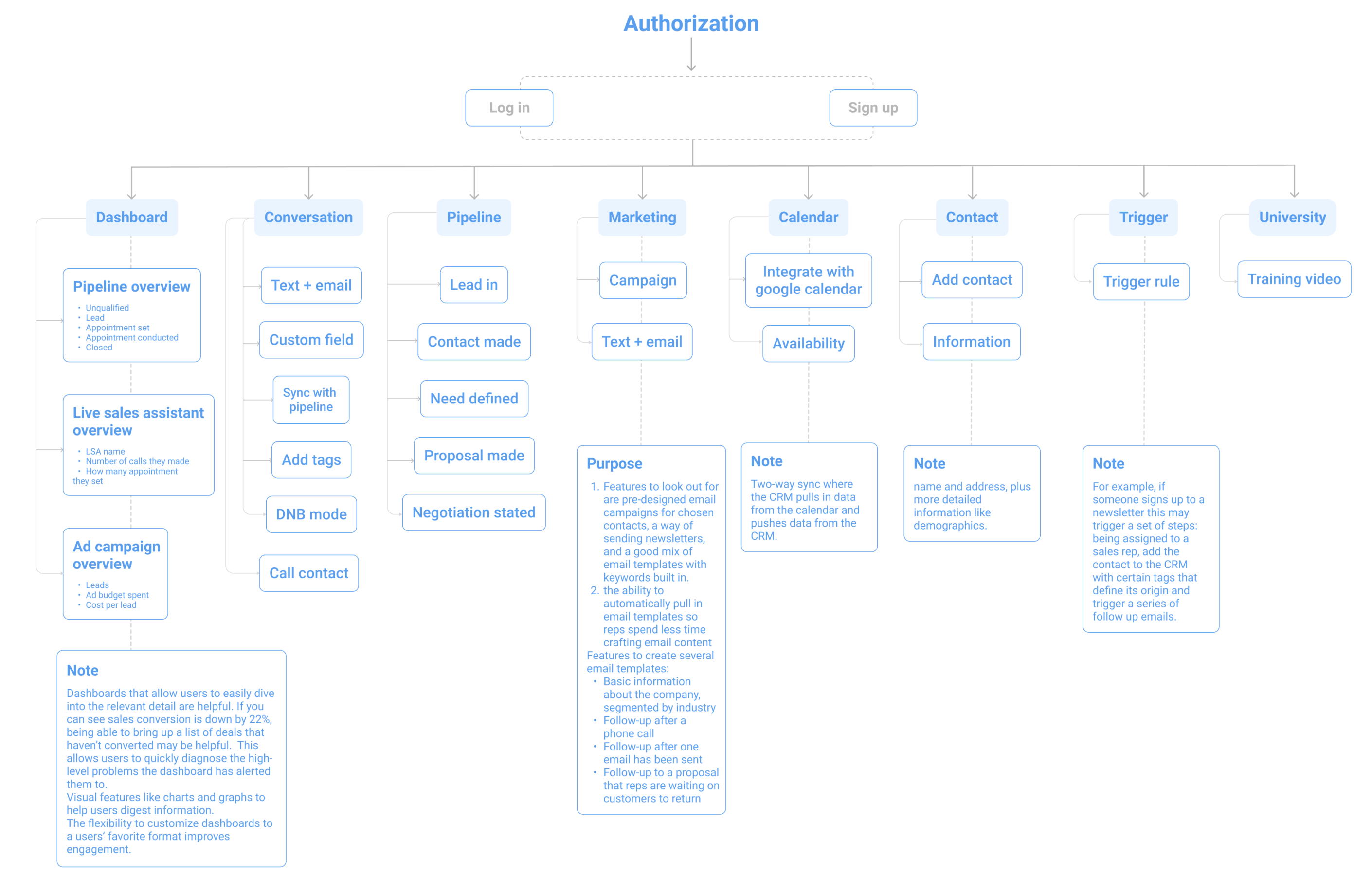
Sitemap
According to the red routes analysis, I adjusted the product’s sitemap to meet users’ needs and goals, as well as make using this app become a pleasant experience.
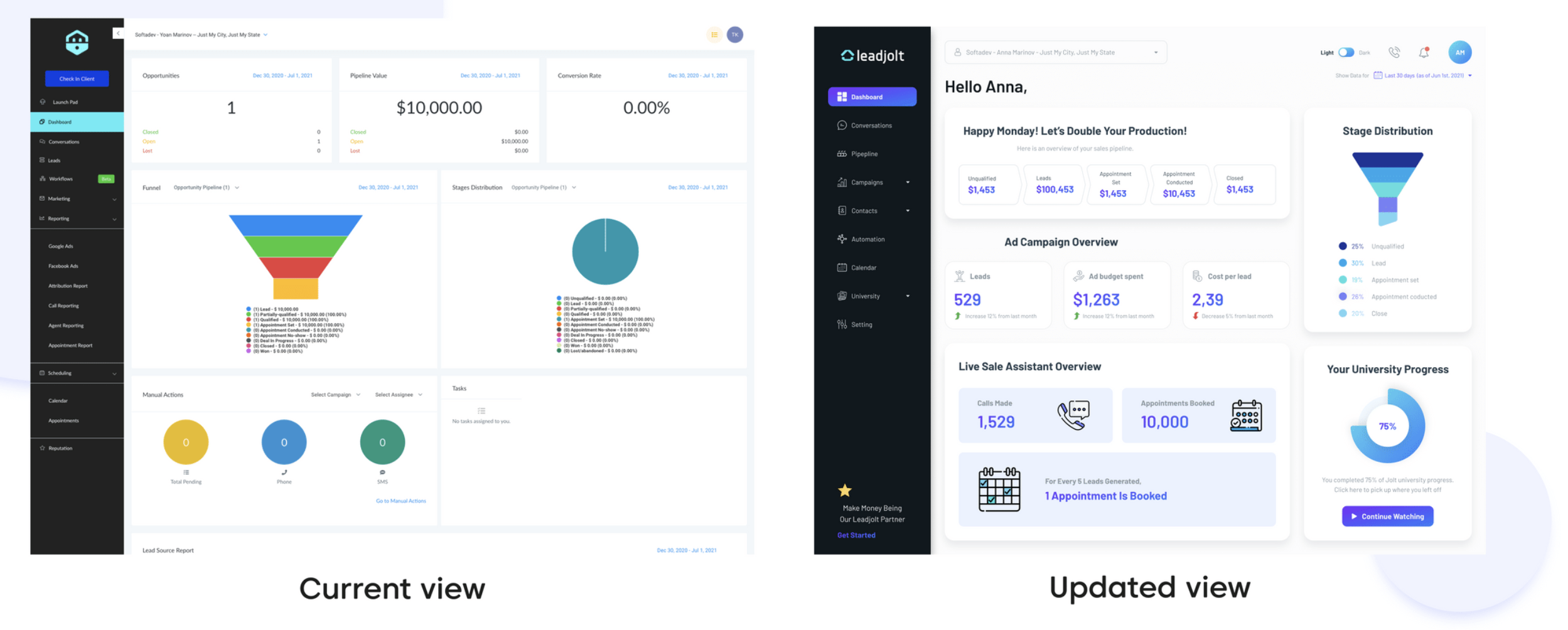
Dashboard with insightful data and better data visualization
The current data visualization is difficult to scan and read. Important data is not highlighted on the main dashboard. The naming convention is too generic, which confuses users.
Solution: By prioritizing the data related to product performance, putting the information in the same categories into separated groups, and differentiating them by using different types of cards, the visual hierarchy is much better. I also added two other features that were requested by many users: notification and call button.
Manage Conversations With the Leads Effectively
The main actions and contact info were not separated. Therefore, it was hard for users to navigate through the interface. Call button was put in a hidden place.
Solution: Use different action buttons for each task card, which help user prioritize the message/tasks that need to be solved first and can quickly access the action stage. Separating the contact information and main actions button into different cards. Place the call button on top of the main section which makes it more convenient for the users.
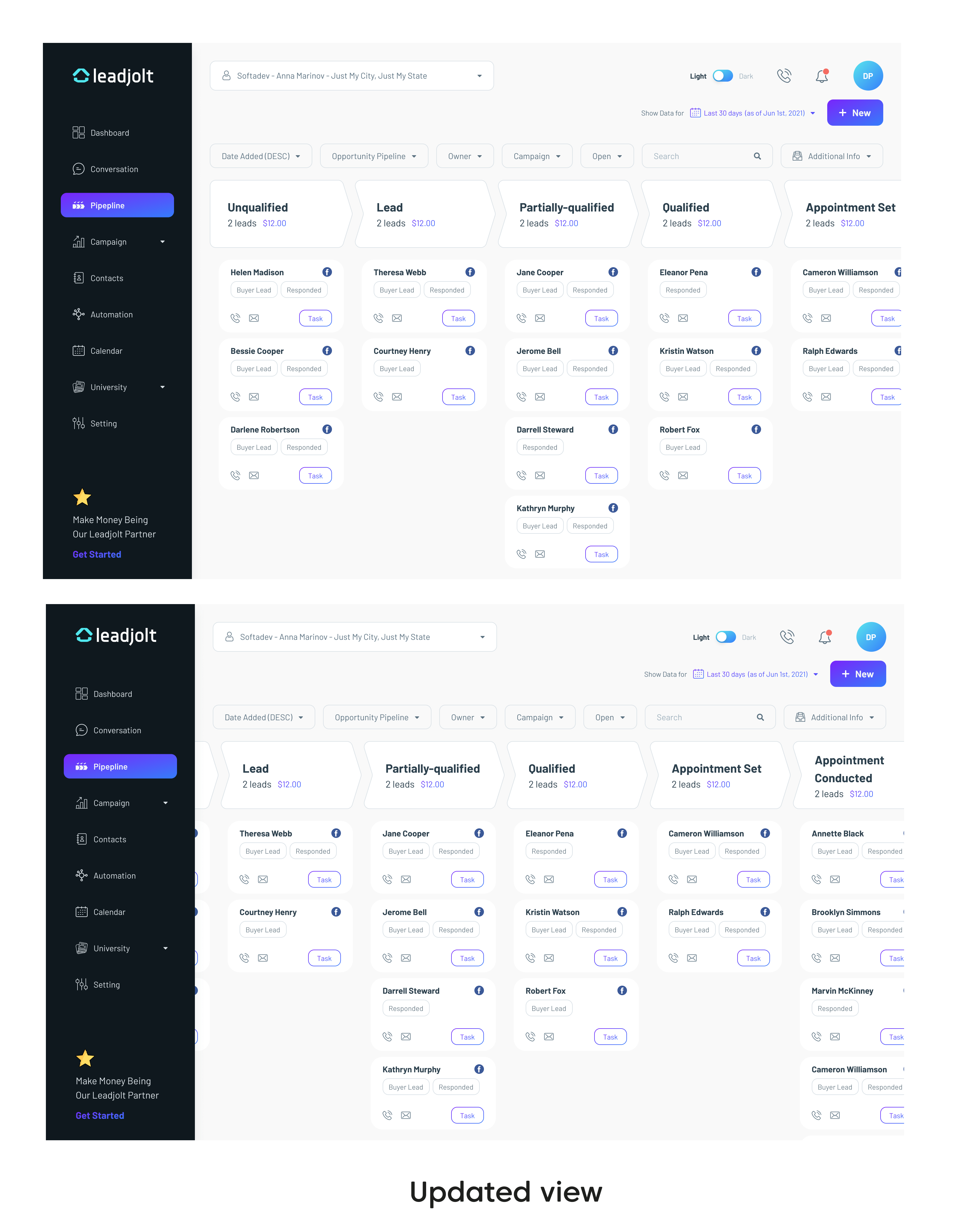
Easy To Track the Sale Pipeline
The sale pipeline is one of the most important features in the CRM. However, confusing interface makes it hard for users to use and track the sales progress.
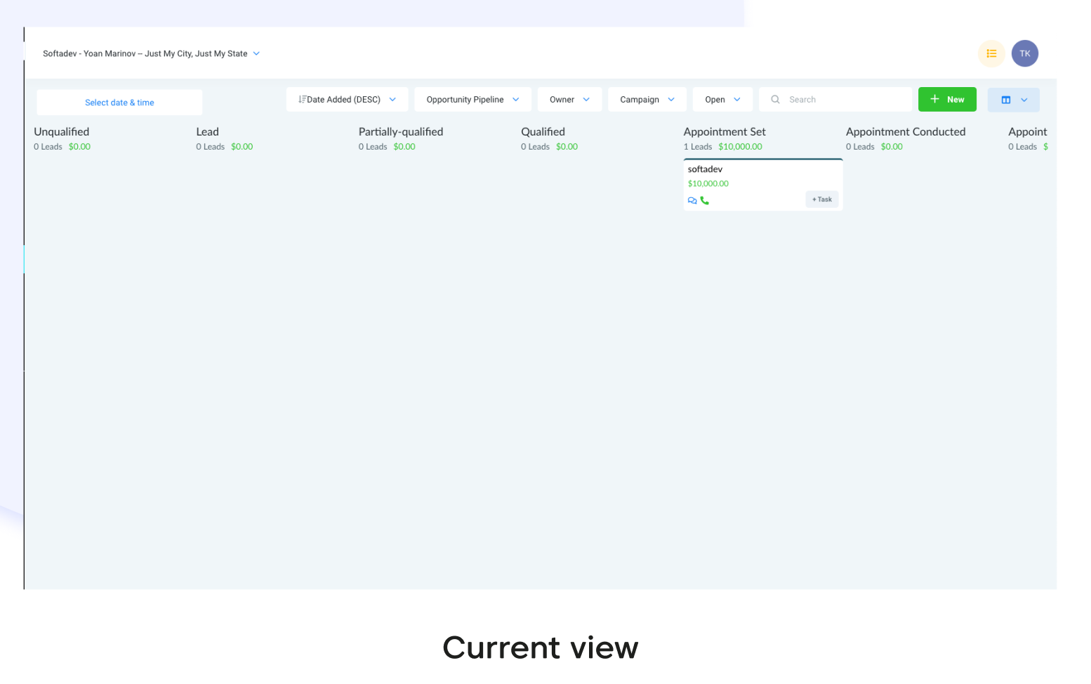
Solution: Making the filter row more compacted and easy to differentiate them with the main table. The filter was curated better to save even more time for user. The main headers were designed as an arrow header to represent the whole progress, makes it become more intuitive experience. All the confusing icons were replaced or added labels.
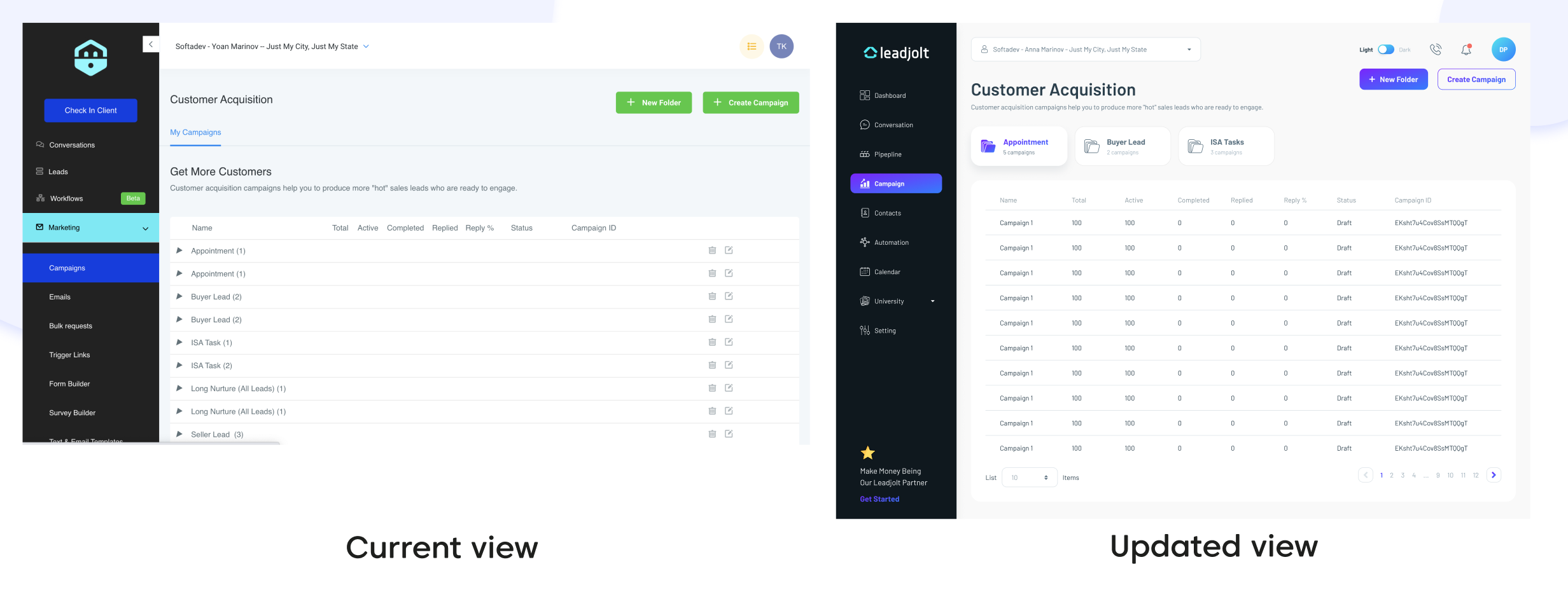
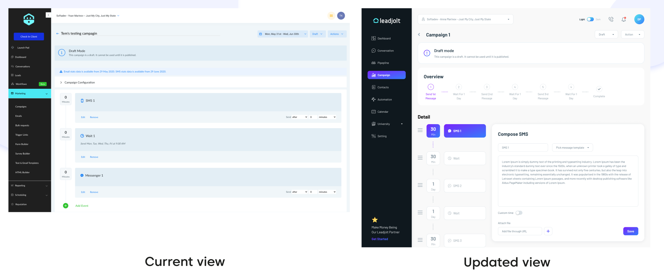
Manage and Create Marketing Campaigns
Step 1: In the Campaign feature, users can build and set up email sequences using marketing automation. However, the current design lacks clear distinction between folders and campaigns. The table headers add to the confusion as they do not align with the content rows. This makes it difficult for users to locate specific sequences, requiring multiple steps. Novice users may question their next actions or avoid using this potentially helpful feature due to weak signifiers in the interface.
Solution: Divide the folder and campaigns into seperated sections. Make the folder with shadow effect helps users realize it as a signifier. All the campaign information is visible in the first screen and doesn’t require users to go through several steps to get there.
Step 2: In step 2, users can create an email sequence and set up email marketing automation. In current design, it didn’t provide a clear view of the sequence’s progress. Users need to go to another step to edit the message.
Solution: Provide a progressing bar so users can get an overview of the email automation progress. User can also edit the message easier or choosing to use an email template. The place of each step can be changed easily by using icon to drag step to the desired place.
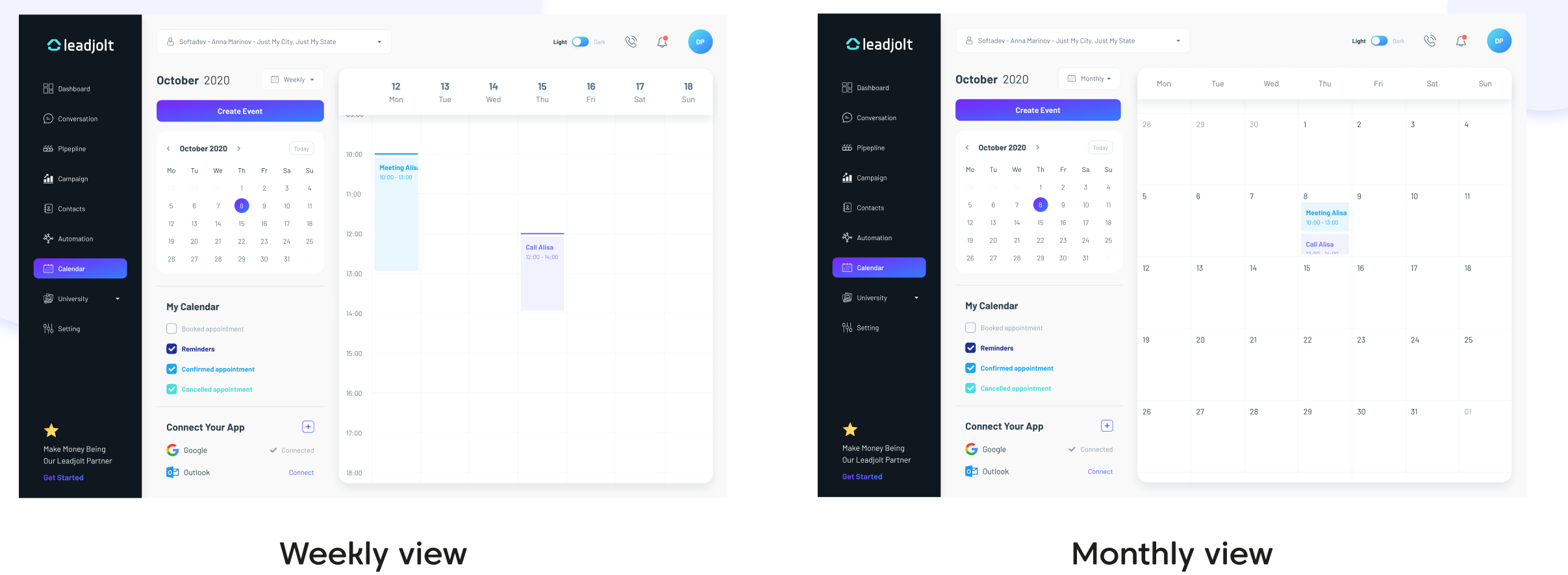
Integrate Calendar with Other Softwares
To manage the appointment better, users can integrate the calendar from other apps such as Google Mail or Outlook. By using the CRM, they can have a quick overview of all the appointments they have and create another appointment through the CRM. The appointments are divided into different types (booked appointments, reminders, etc.) and filtered by using different background colors.
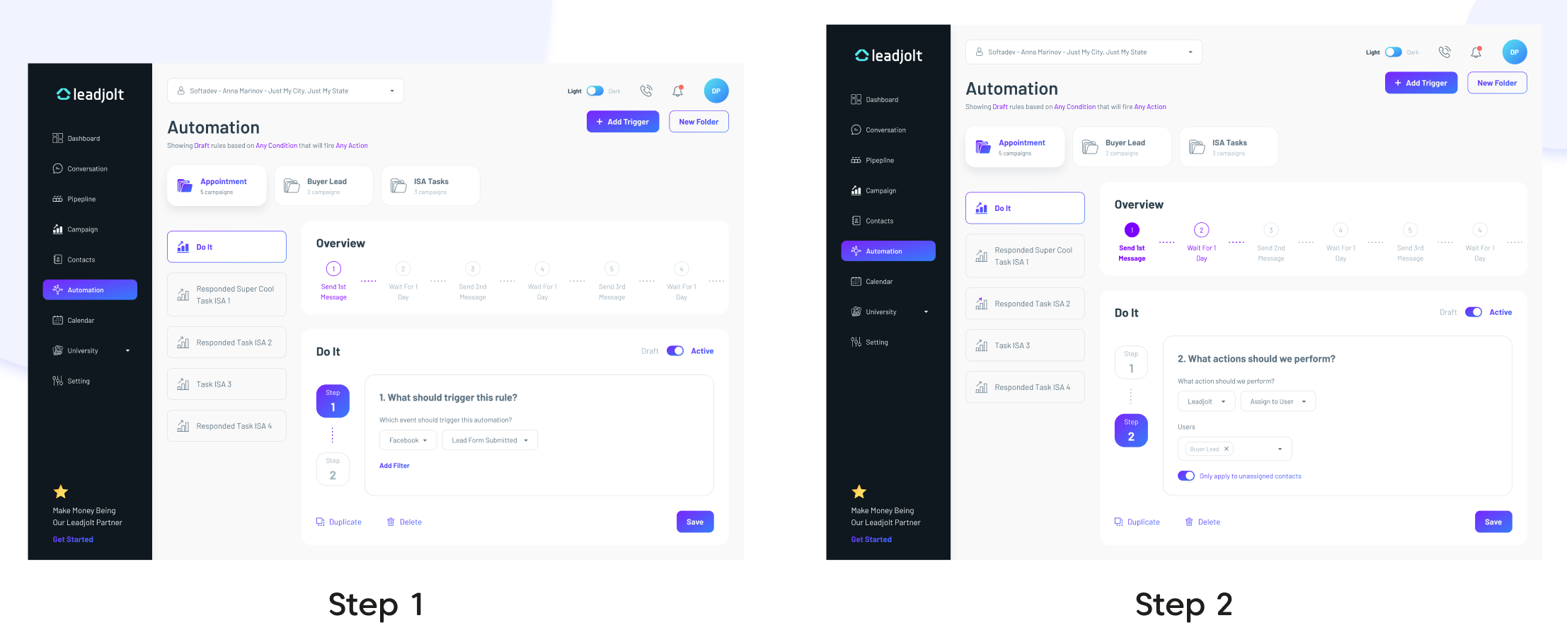
Automate Trigger Series
This feature was requested by many customers of Leadjolt. With the Automation feature, users can create their own rule/scenario to trigger the email sequences. The automation screen’s layout is quite similar to the Campaign’s screen, which helps users realize the relationship between these two features since Automation is a supplementary part of the Campaign.
Learning Resources
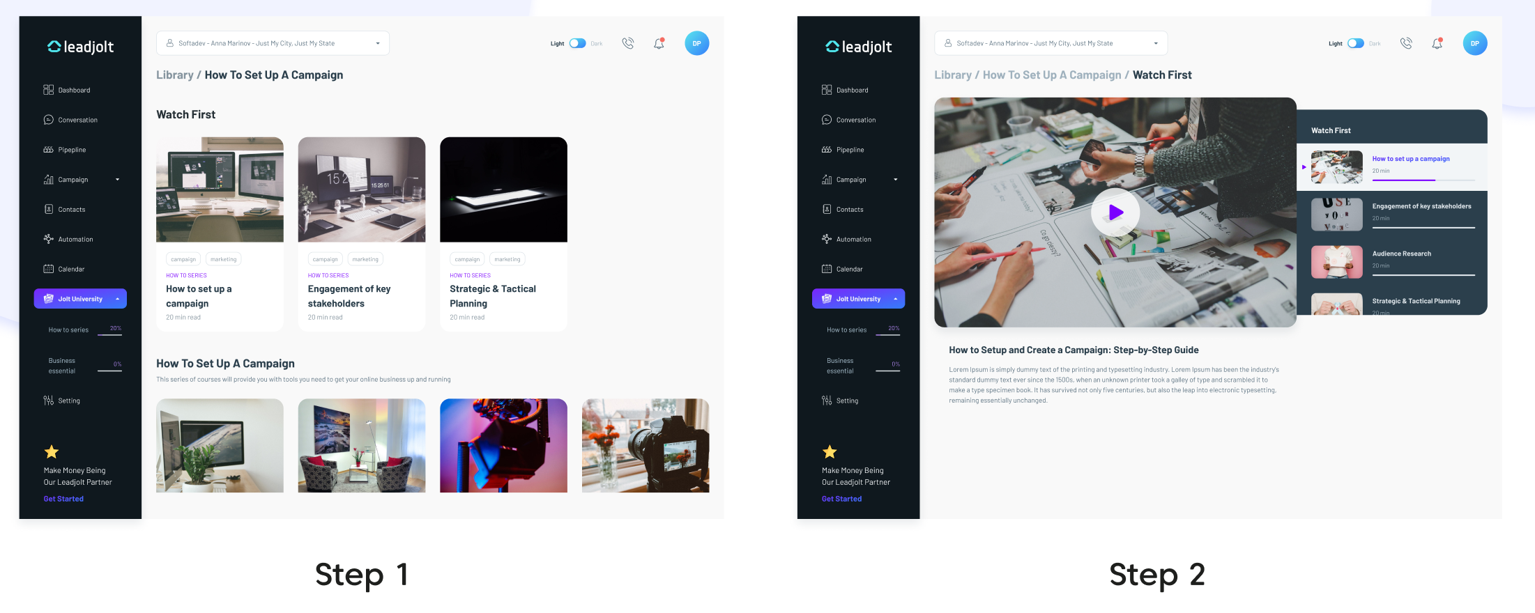
1 of the heuristic issues that the current design had is lacking help documentation. Therefore, providing a place where users can find help and documentation is necessary. On this Jolt University page, users can find different courses related to real estate, sales, marketing, and how to optimize the CRM to achieve the best results. The progress bar helps users track their learning process and motivate them to complete the course. In other words, users can get more out of Leadjolt CRM (find their aha moment quicker) by taking a course or tutorials.
Dark Mode
Since dark mode has been well adopted by big tech companies, we decided to create a dark theme for the CRM. This helps users focus on the key elements of design and copy.
Success Metrics
I am working closely with the full-stack developer and product owner to implement changes. Until then, some of the metrics I would track to measure our success include:
・Task completion
・Time on task
・Friction points
・Engagement rate: Pages per visit & Time on site
Results
After completing the design wire, we conducted a usability test and the feedbacks were mostly positive from participants. The new design increased by 31% of task completion and reduced by 18.42% time on task for the users (compared with the old design). All the friction points that we noted down when conducting UX audit decreased by 28%.
The whole project was a great learning experience for me since I can collaborate with other stakeholders and work in an agile environment.
Another new perspective that I just learned through this project is doing design with business goals, as well as user, needs in mind, and how to balance between these two factors to achieve the best results (in other words, create a solution that can satisfy users by solving users’ pain point but still helps business growth).
Main Tasks
I am the main UX designer in this project. Collaborating with the project manager, and branding team as well as communicating with clients throughout the project. My tasks were:
- Collect customer insights
- Define the project’s scope and requirements
- Create user segments and conduct competitive analysis
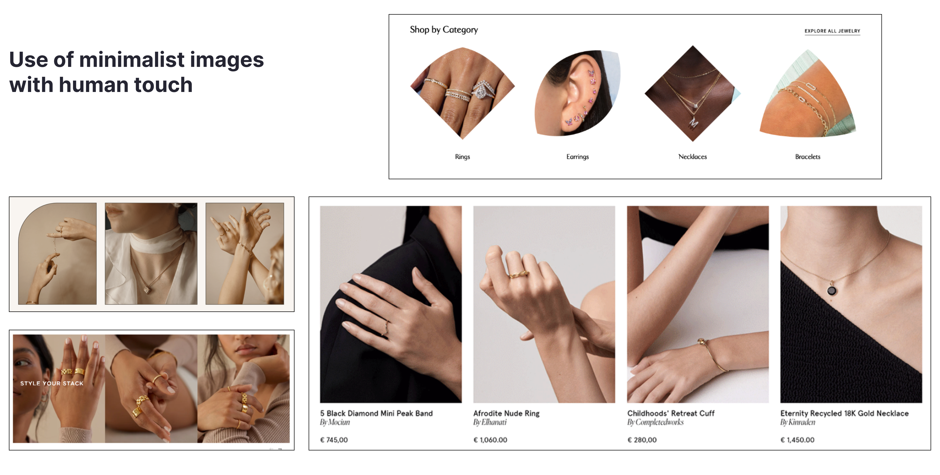
- Ideate and propose UX/UI solutions
User Goals
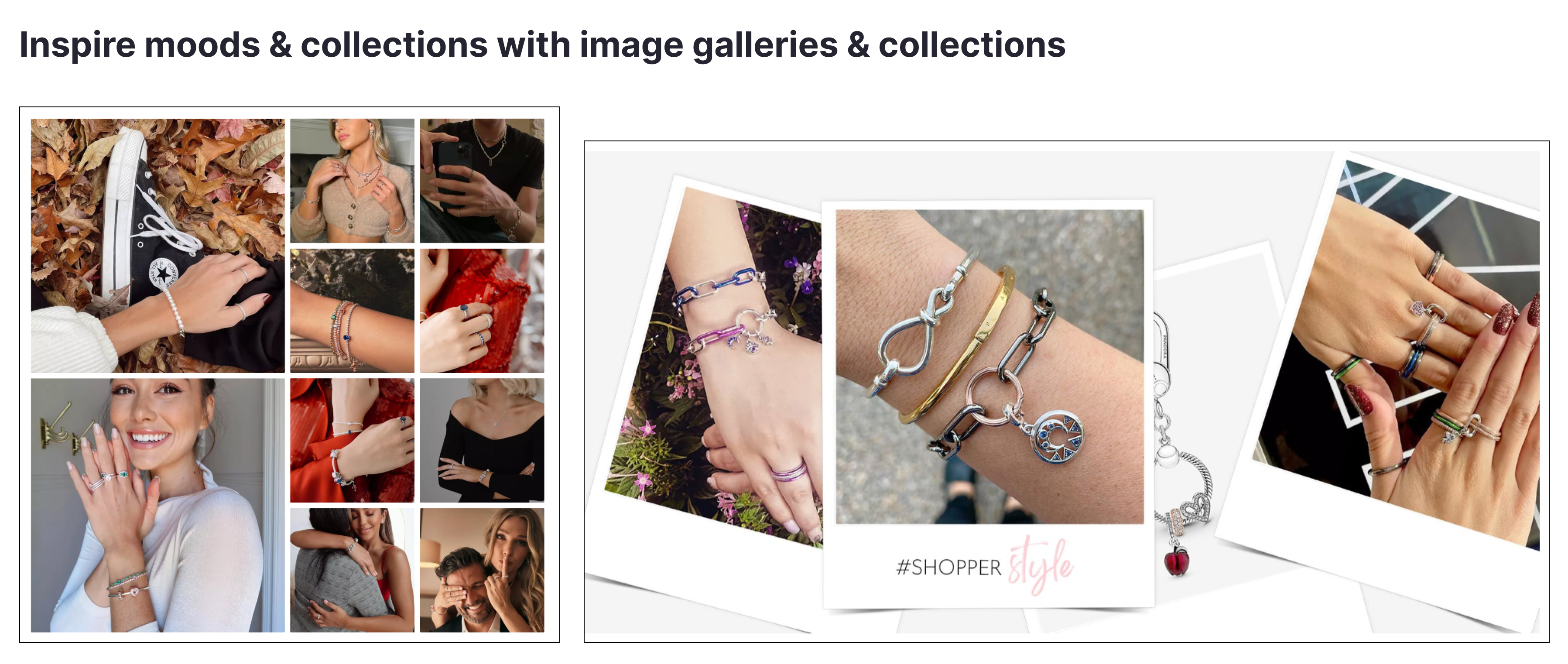
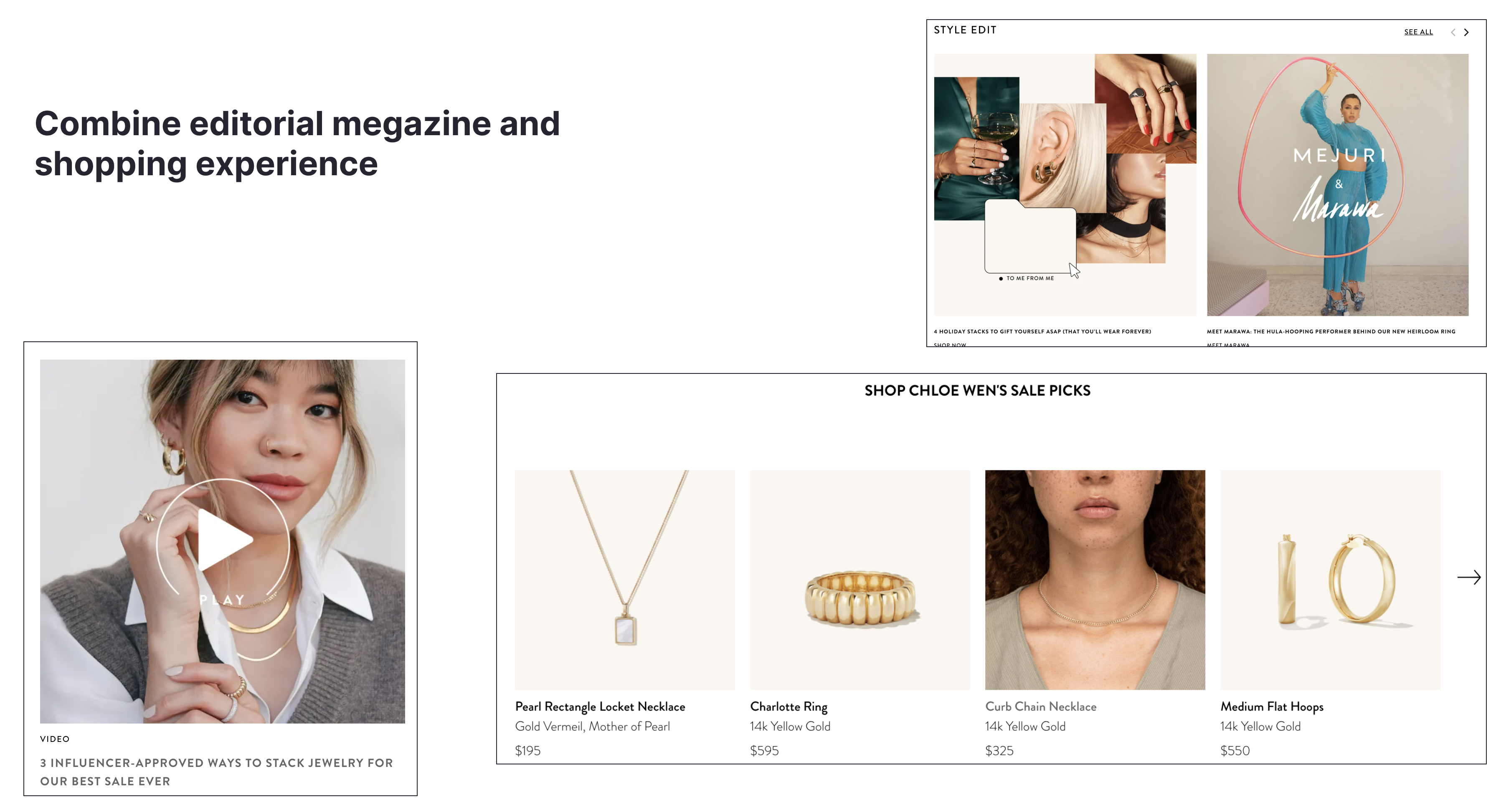
- Help users choose suitable jewelry, mix and match to create a set that can express themselves through their outfits.
- The vast majority of shoppers don’t make frequent jewelry purchases, but when they do, there is usually significant research and comparison involved. For retailers, gaining shoppers’ confidence during this process is paramount to converting them.
- Creating an inspiring product discovery process that connects shoppers with the items they’re seeking the way an experienced sales associate would in-store
- Optimizing the customer journey for mobile, so shoppers can feel secure buying from their preferred device
Key Demographic
Primary Group
- Age: 21-30 Years old
- High-income women, trendy fashioners
- Prefer shopping online with reliable jewelers because they want to save time and also easy to compare prices, styles, review
Secondary group
- Age: 31-40 Years old, and the group of Under 20s
- Either want to gift or not at the moment
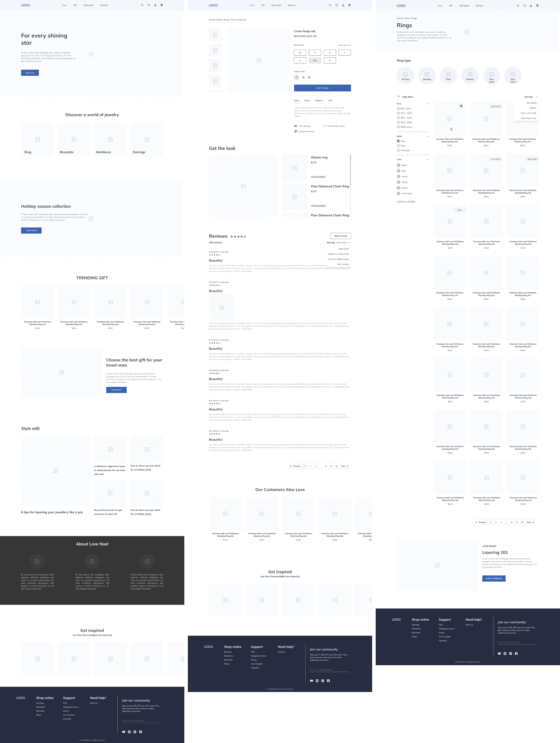
Main Target Customer Groups
.png)
.png)
Competitor Analysis
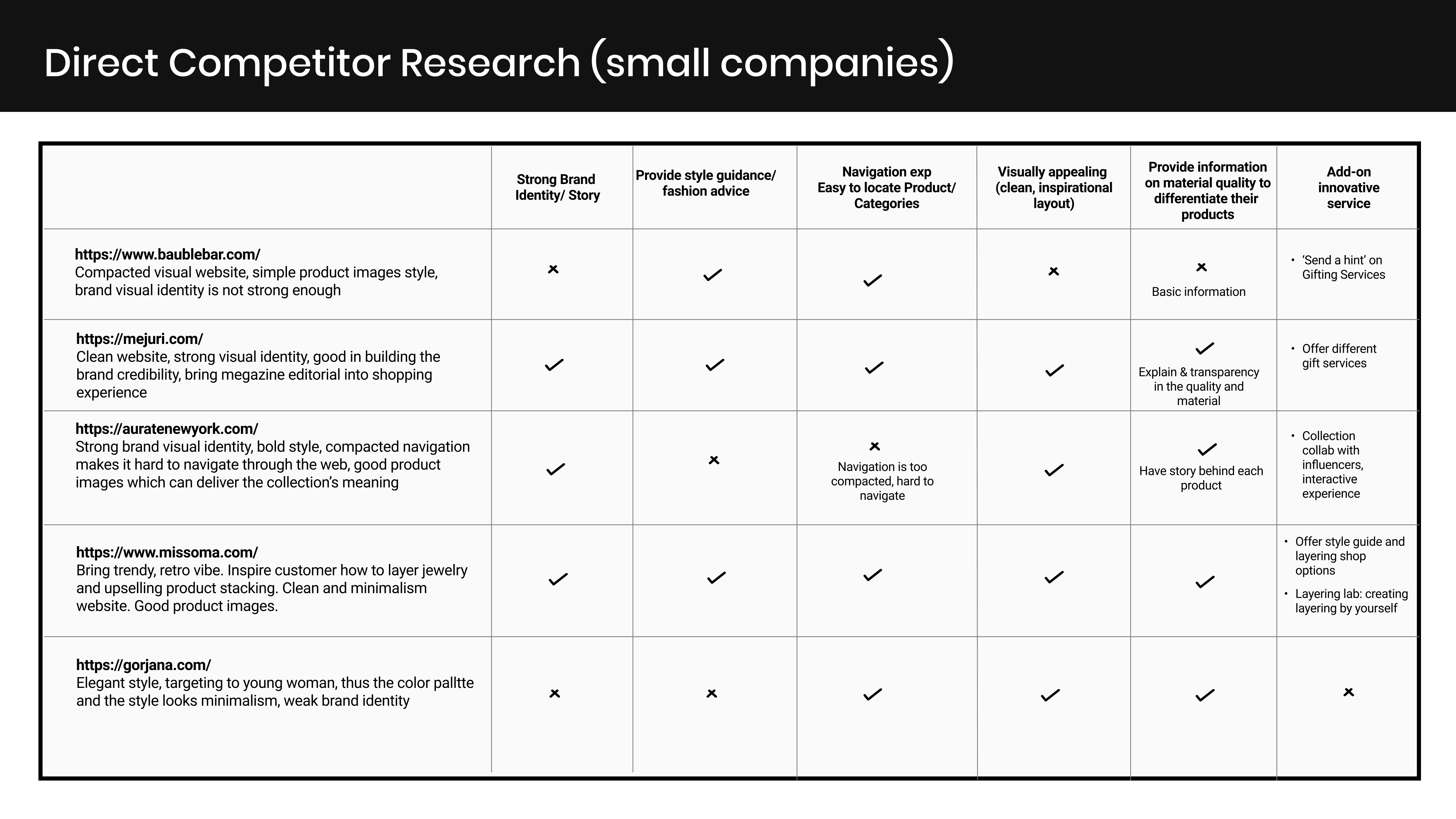
Key Findings
.png)
UX Approach
UI Approach
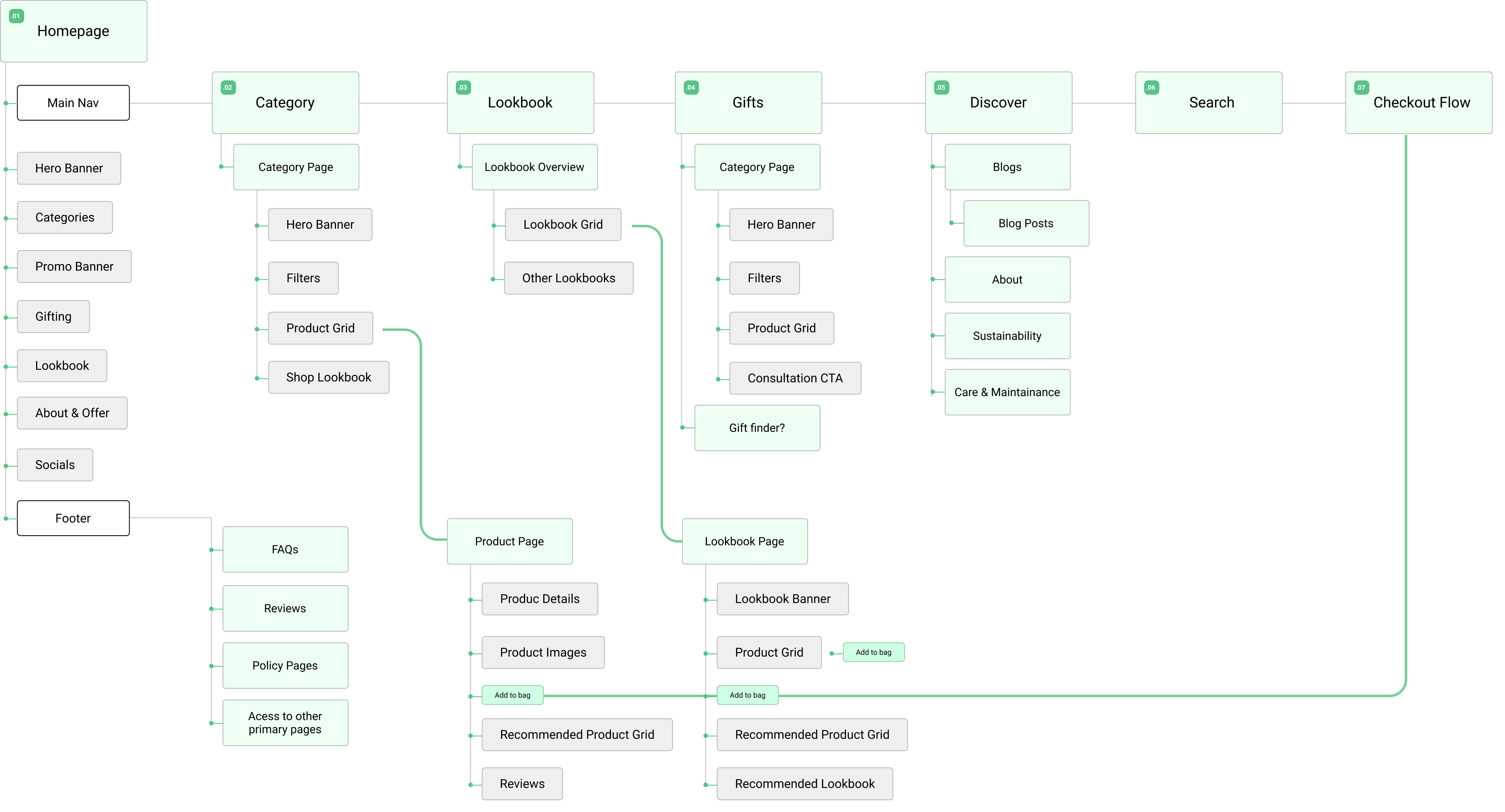
Sitemap
Wireframe
UI
.png)
Research Goals
Given that we already have user stories and the assignment time constraints, I decided to direct my research efforts towards competitor analysis. In a genuine scenario, however, depending on available time and resources, I may perform user research to delve further into user needs through both qualitative and quantitative research methods.
Understand current solution and competitive landscape
How other public transportation apps help their users rent the vehicles? What works well, and what could be improved in the current landscape?
Competitor Analysis
For my competitor analysis, I selected three prominent bike rental applications in the European market. I concentrated on the key features outlined in the user stories, assessing their strengths and areas for improvement. Additionally, I examined user feedbacks in Google play/App store to uncover additional requirements for renting bikes.
Check the analysis detail here
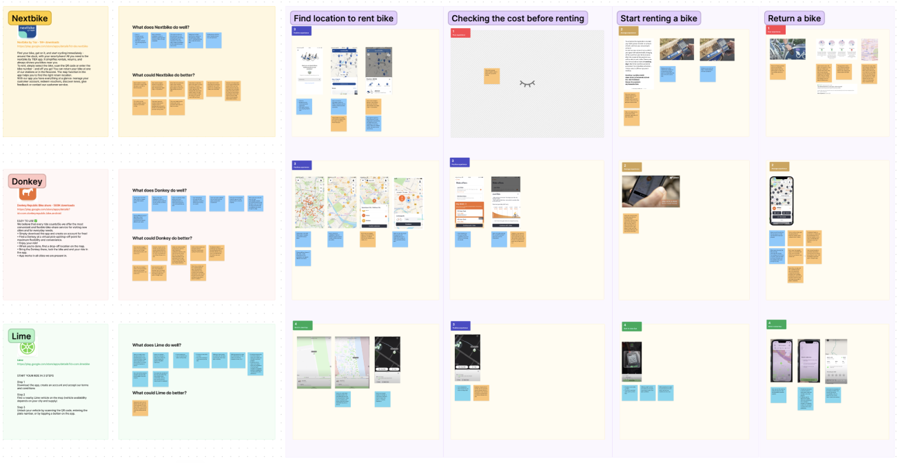
Key Insights
Check the analysis detail here
- To make it easier for users to locate bike rental sites, provide maps with directions, bike availability, estimated distance and time to the location.
- Ensure users can easily understand the estimated ride cost with their estimated rental time and/or distance before initiating a rental.
- Offer multiple payment options to enhance user flexibility when starting a bike rental.
- Allow users to select alternative location options if GPS signals fail to work.
- Clearly warn users about extra charges if they fail to return the bike to the specified drop-off location before renting
- Provide users with drop-off location details before rental to avoid any unpleasure surprises.
- Confirm with users that they have properly ended their rental to prevent technical issues or misunderstandings leading to extra charges.
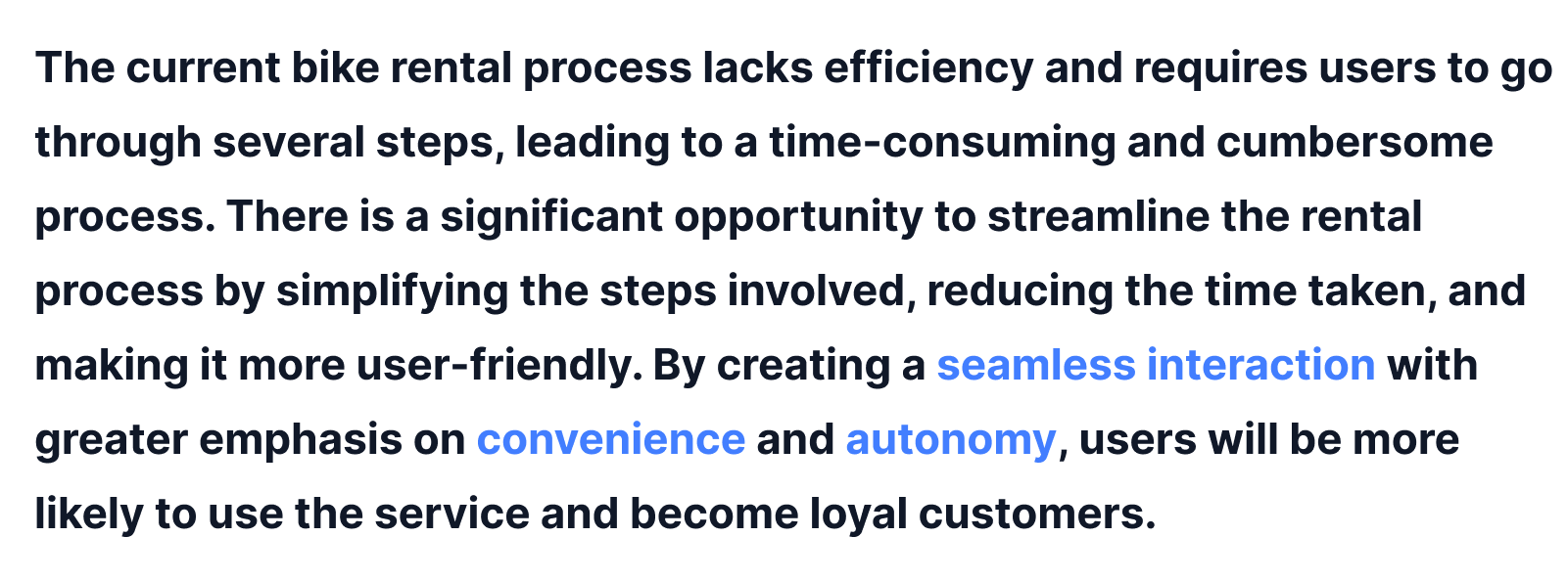
Problem Definition
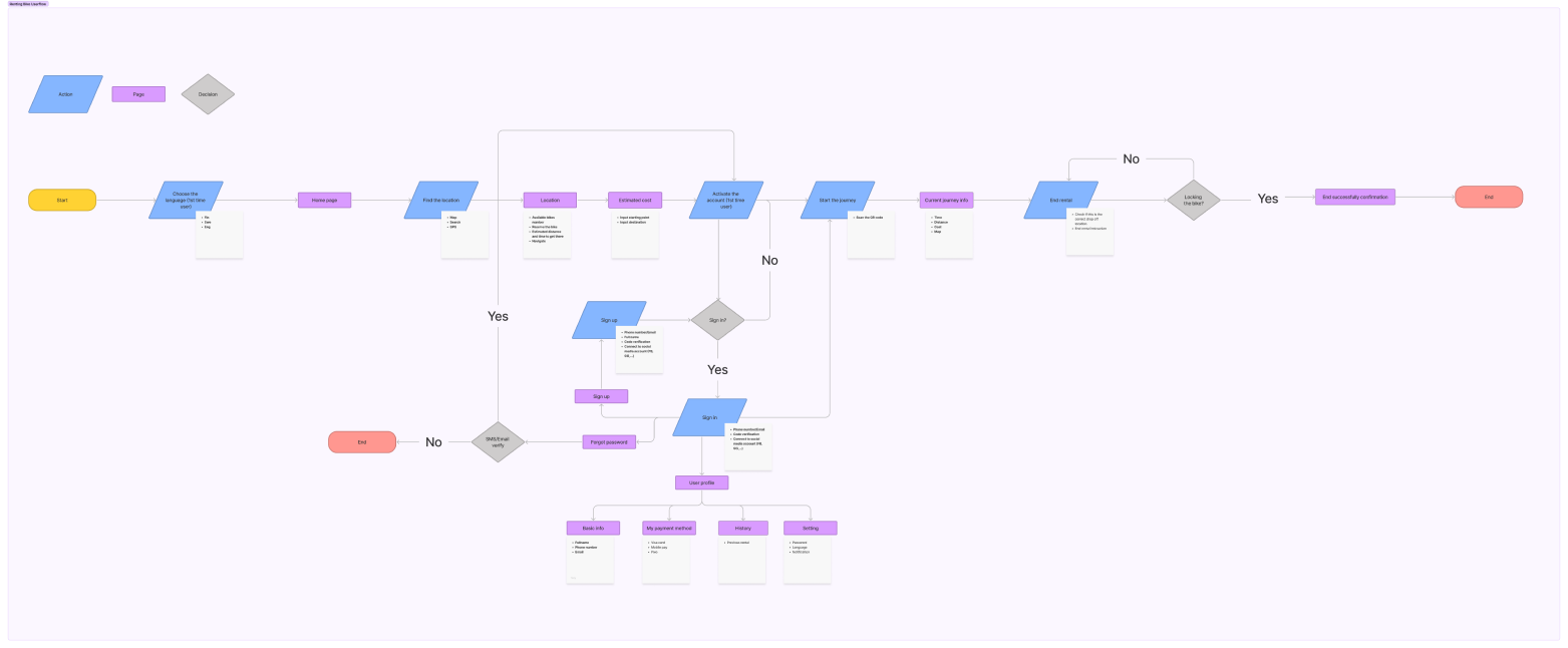
Renting Mobile Flow
To obtain a comprehensive understanding and overview of the system's functioning, particularly the payment process, I opted to construct the complete flow for a first-time user.
Check the flow detail here
Storyboard
I developed a storyboard to enhance my understanding and design of the task at hand. By adopting a user perspective and situating it within context, the storyboard aids in comprehending the flow that I aim to concentrate on.
Renting Bike Flow
Due to time limitations, I have only designed the user flow for those who have already registered and activated their account, including inputting their payment information. Thus, in the following flow, users proceed directly to renting a bike without having to go through the payment process.
Screen 1: Hompage
The homepage displays a map that shows all the available stations near the user's location (users have allowed the app to access their GPS). Users have the option to interact with the map by zooming in or out to view additional stations.
Screen 2: Choose 1 station
Once users have selected a particular station, the system displays information about the station, including directions for users to navigate there.
Screen 3: Estimate cost
Users are able to estimate the cost of their ride from the selected station to their final destination. To reduce the number of steps for users, the starting point of their journey - the chosen station - is pre-filled.
Screen 4: Estimate cost results
The estimation of the cost is dependent on the calculated time and distance for the journey, with a clear explanation of the applicable rates provided. Users are alerted to the importance of returning the bike to a designated station and are informed that a service fee may be incurred if the bike is returned to an unsuitable location. At this point, users have the option to view drop-off locations near their final destination and can also reserve a bike at the selected station.
.png)
Screen 5: Scan QR code
Upon scanning the code to unlock a bike, users are prompted with a reminder of the applicable rate and the location of the QR code on the bike is displayed. This feature can be especially helpful for first-time users.
Screen 6: Ride in progress
Monitoring the progress of the journey by tracking time, distance, and estimated cost can be beneficial for users. Additionally, tracking the calories burned during the ride can be particularly useful for users who cycle as a form of exercise, providing them with more motivation to continue cycling.
.png)
Screen 7: End - Confirm station
Once users decide to end the bike rental, a confirmation message is displayed to ensure that they have returned the bike to the official station. The app also displays the location of the nearest drop-off station in relation to the user's current location, along with the option to receive directions to that station.
Screen 8: End successful
Following the end of the bike rental, users are presented with a confirmation message that includes tracking information. This is an opportune moment to request user reviews. Additionally, the app provides users with access to assistance and support, as well as the option to obtain a rental receipt.
.png)
Validate Design
To validate the design flow in real-world scenarios, conducting user testing and tracking usability metrics is essential. Heatmap analysis can help identify areas that require improvement. Some key metrics applicable to this case include:
- Time on task
- Success rate
- Drop rate and drop-off points
- Error rate
Furthermore, conducting tests in real-world contexts, such as observing users renting bikes outside in varying light conditions, can provide valuable insights into how the app performs in authentic environments. This approach allows for a deeper understanding of how external factors, like lighting, impact user interactions with the app during the bike rental process.
My responsibility inside the team
I took charge as the main UX/UI designer in this project. I collaborated with the project manager, and development team as well as communicating with clients throughout the project.
Main tasks:
- Business requirements gathering
- User journey mapping
- Conduct competitive analysis
- Define UX goals and propose UX strategy
- Wireframing and rapid prototyping
Problem Statement
We want to ensure our customers have a top-tier experience with Webgasm website, with great animation and effect, and detailed information but still ensure the loading speed.
Thus here are the main questions we need to ask when working on this project:
.png)
Competitor Analysis
-min.png)
Key Findings
Our competitor research shows that successful web development agencies must:
UX Strategy
From our research findings, we propose our UX Strategy for this project:
- Provide clear layout information, especially for the services/process
- Building trust for customers with stats/case studies/testimonials
- Education/learning for the users who are cautious or unsure of their decision (using blogs, FAQs)
- Pricing calculation helps customers to estimate the budget for their project
- Improved user navigation with clearly defined services/other sections
- Provide an explanation for specified terminologies when necessary
UI Strategy
- Use of illustration that unique and convey the meaning/brand identity
.png)
- Use of illustration that unique and convey the meaning/brand identity
.png)
- Bold and Confident copy/messaging to differentiate us with other agencies.
.png)
- Use of tool interaction for key features (e.g process) to provide a helpful to use experience online at the same time showing off our development skill
.png)
Sitemap
Wireframe
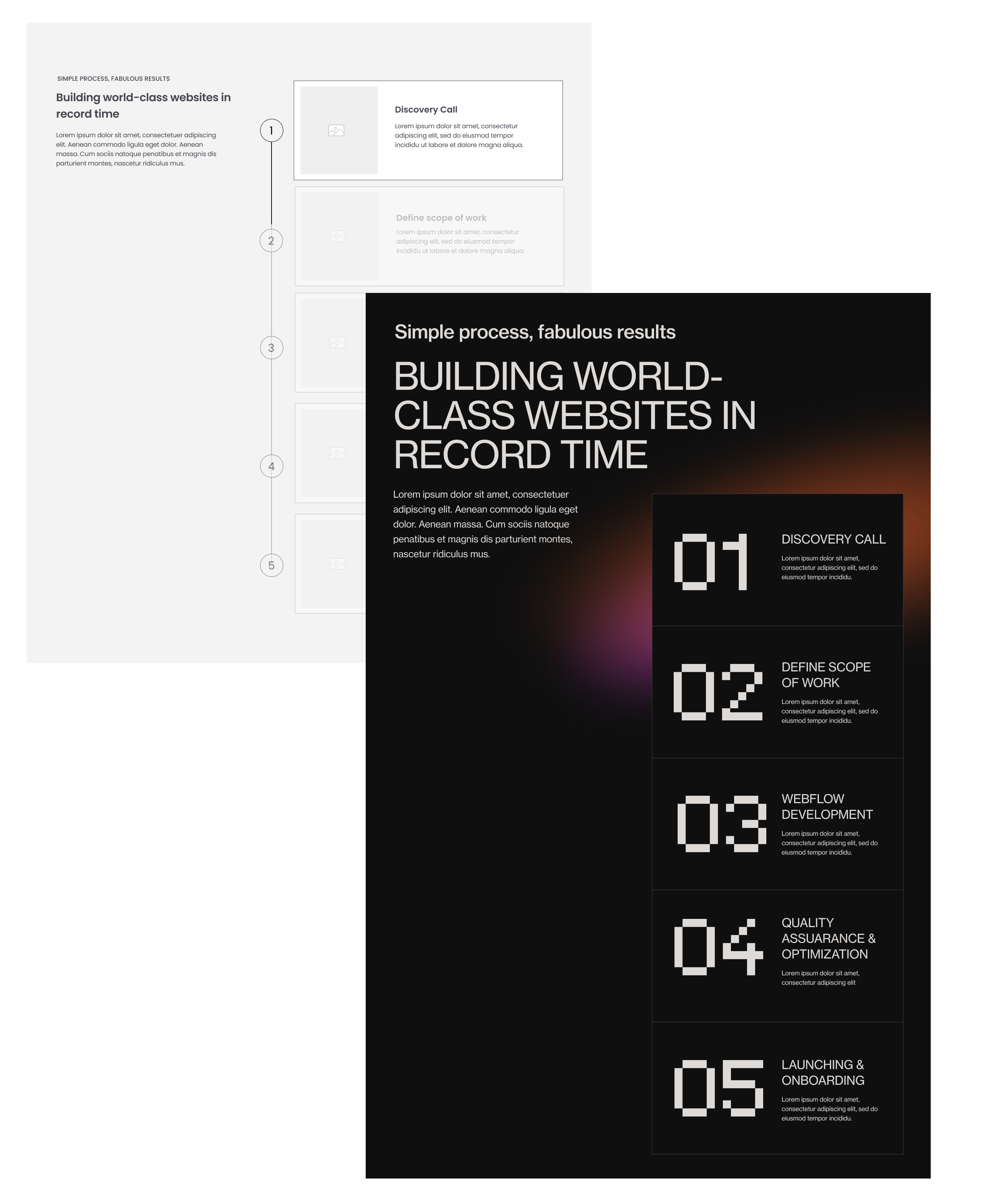
Include a strategic process
Since web development is such a complex endeavour with many moving pieces, clients need to see a thorough and intentional process to feel confidence in our ability to deliver successful project for them.
Pricing calculator
Provide a transparency price can gain more trust from customer. It also encourage potential customers with different budget to engage with our CTA
.png)
Add credibility by using social proof
Testimonials can increase conversion rates on sales page by 34%. There are many types of social proof that be used in Webgasm such as testimonial, case studies, stats, etc.
.png)
.png)
.png)